
Animated Web Banner
Make it move
The Brief
Animate a logo in a simple way that adds value and that stands up to repeating viewing
Trim Size
1200 × 600 px
Learning Points
Using Offset Path to create a multiline effect
Using the Photoshop Timeline panel to create a frame-based animation
Tools
Illustrator, Photoshop
Inspiration
Monoton https://fonts.google.com/specimen/Monoton
Summer of ’76 https://creativemarket.com/Darumo/2700198-Summer-0f-76-Multi-Line-Font
The Electronic Frontier Foundation (EFF) runs a yearly fundraising project called Power Up. It’s one of those “double your money” things — a few wealthy donors put up the big bucks, and regular folks match that. Your donation is doubled or sometimes tripled. Helps keep a non-profit afloat!
In 2019, Hugh’s colleague at EFF, the amazing designer Caitlyn Crites, designed a fantastic web banner for the project. With her permission, we’ll feature it here and walk you through her process.
Caitlyn began with some inspiration: those 1970s-style multi-lined fonts. When Hugh was a kid, everything was made out of this type, and it would say things like “Up With People!” or “Water Beds On Sale!” (Caitlyn herself wasn’t alive in those days, but she has the good taste to appreciate it.)
Caitlyn thought it would be a fun challenge to design her own version of this type and to animate it in such a way that a color gradient seemed to move through the lines — almost as if it were a neon sign with changing colors.
Building the type in Illustrator
Starting in Illustrator, she decided each arm or leg of her font would consist of three lines. This made the first step easy: start with the middle line. She drew the letterforms using guides and simple shapes, inspired in part by Gothic sans serif fonts. (One interesting design decision: building the P and R letters so that the main leg does not continue to the top, but instead cuts right and follows the curve of the bowl. When Hugh saw this, he knew he made the right decision in hiring her.)
Caitlyn soon realized that she could not design the base letterforms with the same baseline and cap height. Hopefully, the reason for this will become clear in a moment!

Caitlyn Crites is a designer with the Electronic Frontier Foundation, based in San Francisco. You can see more of her work on the EFF website (eff.org) and on her portfolio site: caitlyncrites.com.

A good weight for the stroke at this point seemed to be 8 pts. The next step was to offset the shape of each letter, using one of the great, untold secrets of Illustrator: the Object > Path > Offset Path command. She chose an offset of 10 pts. Why 10 pts? This will give 1 pt between the lines, as you can see below. Offset Path will make a copy of your path, and if that path is a single line, rather than a closed shape, it will create the offset by actually making a box around the line. This is why you see vertical some lines that don’t match the final result — you’ll be deleting those!

See the banner in action: supporters.eff.org/donate/power-up-2019
With the Direct Selection tool, zoom in, and carefully select just the bar that you don’t want, and hit Delete. If too many lines disappear, it’s because you selected a point, or the wrong path. Undo, and try again! The end result should look like this:

After deleting the extra lines created by the Offset Path command, the strokes on each line need to be outlined. Then, to create a regular baseline, you’ll use the Knife tool to surgically slice off the unwanted ends.
Now, you can see there is some undesirable randomness appearing on the W and the R. Every person who has ever designed a font is familiar with these problem letters — like wayward children, they are the loveable, memorable characters, but they cause the most trouble! Sorry to say, but we’re going to have to clean up this mess.
You still have your guidelines for cap height and baseline. You’ll use this to cut those forms off. But first, the 8 pt strokes on all the lines need to be turned to outlines. Select everything, and choose Object > Path > Outline Stroke. At this point, instead of the forms being defined as lines with strokes, they are now each boxes with a fill. (Before taking such a drastic step, save a copy of the letterforms made with strokes on another layer, and then hide that layer. This way, if you need to go back, you can.)
Now, using the Knife tool (on the same tool space as the Eraser tool), select the W, and with Option/Alt (for a straight line) and Shift (for a horizontally constrained line), drag horizontally along the guidelines. This will divide those shapes right on the guideline, and you can then select the unwanted shapes with the Direct Selection tool and delete them.

Offset Path creates a triple line effect, but it also creates a box around the original line. Use the Direct Selection tool to carefully select those unwanted lines and delete.

Use the Knife tool (same tool space as the Eraser) to slice off the unwanted vector shapes.
You may notice that the W still does not look correct. The different Vs are all conflicting and overrunning one another. You are shaking your fist at W. Why, you ask, are you so willful and wayward! You wily, wicked W! Luckily, this is something that can be fixed with some Pathfinder surgery.
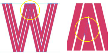
The double Vs in the W overlap. To fix this, select the shapes and use the Pathfinder panel to divide them.
Then, select the unwanted shapes and delete them, before once again unifying the shape with Pathfinder Merge.
With the Pathfinder panel, select every shape in the W and hit the Divide option. Your W is now made up of dozens of tiny shapes — each place a shape overlapped, it is now a separate, selectable (and deletable) shape. With the Direct Selection tool, carefully select each unwanted shape and terminate with extreme prejudice. You’ll want to zoom in to an ant’s eye view! Once that’s done, select all the remaining pieces (use the Selection tool, they should be a group at this point), and in the Pathfinder panel, choose Merge. Voila!


To edit this letterform so that it has a consistent baseline, outline the strokes, and then use the knife to cut the forms along the baseline, deleting the unwanted shapes.
Now, having grouped everything with your heavy use of the Pathfinder panel, you’ll want to ungroup (a few times, to be safe). The reason: Now is the time to get out your Color panel and have some fun!
Caitlyn chose three tones, one for each line of each letter, and to have the brightest tone be on the inside of the shapes, and on the left side of each leg. Try selecting each of these lines with either selection tool and applying a bright turquoise. Then choose mid-tone blue for the middle stroke, and a darker blue for the last line.
Layer the colorways
At this point, we suggest starting fresh with a clean slate. Cut and paste your shapes into a new file, making sure to avoid any extraneous bits of artwork or unwanted layers.
It will also help to start with some organization. Select all the lines with dark blue, and group them (Cmd/Ctrl G). Do the same with the other colors. Now, if you open the layer hierarchy in the Layer panel, you’ll see three groups inside your Layer 1. If you need to change a color, you can click the group, or the target for the group on the Layers panel. Get organized and name your layers!
Duplicate the layer, drag the copy to the top, rename it, and choose three different colors. The new colors should be analogous in some way so that they are shading away from blue on the color wheel.
Now construct an Illustrator document with 8–10 layers, each with a subtly different color scheme. Each layer will become a frame in the animation!

Left: Illustrator Layers panel. Each colorway has its own layer. Inside each layers are three groups. This makes selecting and changing colors easy. After exporting to Photoshop, the top-level layers are still accessible. You’ll want to add a background color, and with the Timeline panel, create an animation from the layers.
Creating the animation
The Illustrator file should be exported as a PSD with layers. This is for the web, so be sure your resolution is appropriate to your site. You’ll choose File > Export > Export As and pick PSD. Opening that file in Photoshop, you may want a background color. Caitlyn chose a deep, dark blue, almost black.
The Timeline panel is almost comically easy to use (assuming you’ve set up your layers properly!). From the panel menu on the Timeline panel, choose Make Frames From Layers. Now each layer is a frame in your timeline. You probably don’t want your background color to be a frame, so you can select that frame and delete. You can also adjust the time each frame will be visible and whether you want your animation to loop or play only a certain number of times.

The Timeline panel in Photoshop is so easy that even an Internet troll making a meme can use it!
Hit the play button to test the animation. Look good? Choose File > Export > Save for Web (Legacy) and choose GIF, and there you are — the owner of a nifty animated banner! Click the Preview button (bottom left) to view the animation in a browser the way your online audience will see it.