
Visual TOC
Design a table of contents spread
The Brief
Create a two-page visual table of contents spread using InDesign’s Table of Contents to generate the text and to facilitate easy updating if the pagination changes
Trim Size
US Letter/A4
Learning Points
Generating a “live” table of contents
Designing with a grid
Establishing hierarchy
Tools
InDesign
Fonts Used
Joanna Nova
Inspiration
You’ve poured the text, applied the styles, snapped to grid, and completed the layout on every last page. Now there is only one thing between you and a completed project (and an invoice to send): the table of contents.
You may feel tempted to choose the brute-force approach to this problem and type in the page numbers manually. When the pagination of your document changes (and it will change), you’ll have to update those numbers and then update them again. And again. Each time, you’ll think “if only I’d listened to the authors of the The Type Project Book and used the Table of Contents feature in InDesign!” See what happens when we muddle through? We end up in a muddle.
The Table of Contents feature in InDesign is not without its flaws. But it is robust and relatively easy to use, and it will save you a lot of grunt work, as well as ensure consistency in your formatting. Think of it as a helpful robot that wants to do the annoying work you don’t enjoy doing.
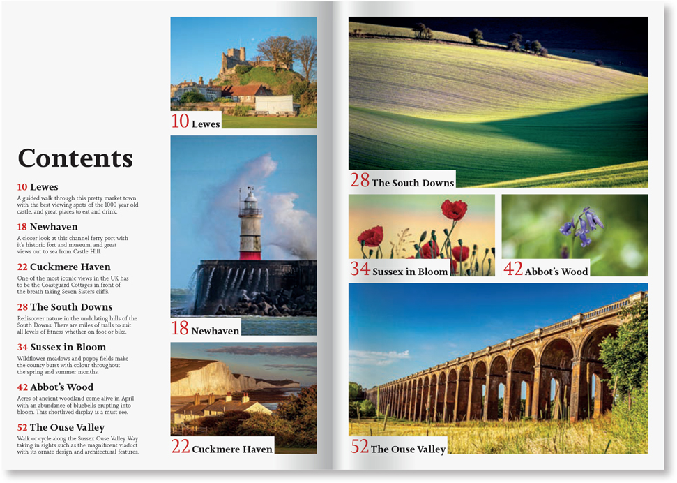
Just to spice things up, this example uses not one but two table of contents: one that is a list of article titles followed by a brief description of the article and the other that uses a large image from the article as bait for the reader. Also, because we don’t like to make things too easy, we’re using a trick — the descriptions in the first TOC are actually hidden text, summarizing the content of the article. This descriptive text does not appear on the spreads themselves. Rather than just reuse text from the layout, this technique give us the opportunity to describe the article in a slightly different and less repetitious way.
What we’re showing here is how to create a table of contents, but also how to use this feature in ways that aren’t obvious. What we’re aiming to achieve is the kind of look you might find in an image-driven magazine where the images are given prominence.
Choose the type
For our fictional magazine — let’s call it Beautiful Sussex — we want a typeface family (or families) that is highly readable, elegant without being too showy, that comes in a wide range of weights, and has all the OpenType features we anticipate using — fractions, different number styles, ligatures, etc. While there are many candidates that meet this description, we chose the slab serif Joanna Nova. What swung things in favor of this typeface family is the backstory of the type itself. Designed by Ben Jones, it’s based on Eric Gill’s original Joanna typefaces, and Eric Gill lived for much of his career in East Sussex, a stone’s throw from the places featured in the articles.

Set up the table(s) of contents
This TOC was created in a demo document, so we needed to use our imaginations. The page structure of the document is established, and the heads are in place on their given pages. The description text is on a hidden layer.
Each table of contents needs its own table of contents styles — did we mention there are table of contents styles? In the pantheon of InDesign styles: paragraph, character, object, etc., the table of contents styles are not the sexiest, but like their more glamorous cousins, they do ensure consistency. And consistency is what we’re after. (Except for those times when we’re not.)
For the first TOC style, choose Include Text on Hidden layers. Its description includes a character style that is applied to the page number, making it red. The page number will appear before the entry. We created the entry style TOC 1 and adjusted its formats until we were satisfied.


The descriptive text in the main TOC is gathered from the text on the hidden “toc description” layer.
For the second TOC, we included the same paragraph style (h1) from the text in the magazine, but applied a different style to its entry. This is an important thing about the table of contents: The style that you apply to the entry can look completely different than the style from which the entry was created.

Generate the first table of contents, and place the text in the space you allotted on the left page. Generate the second table of contents, and when you have the cursor loaded with the text, hold Option/Alt and drag over the picture frames to create threaded text frames that are at the same dimensions as the images. Note that the pictures are on a layer beneath, and we locked this layer for this step.
The Table of Contents feature generated the text we needed — text can be updated when the pagination changes — but it didn’t start out looking right to begin with. We had to make several edits to the paragraph styles to get things how we wanted. The numbers reverse out of a solid color thanks to the Paragraph Shading settings that are part of the paragraph style.

When pagination changes, select the text frame containing the Table of Contents story and choose Layout > Update Table of Contents to update the text in place.

Apply paragraph shading to the large numbers. Note Width is set to Text and Bottom Edge to Baseline.
To change the position of the number with the frame, apply an object style that has its text frame general options set to align the text to the bottom of the frame.

The two tables of contents: TOC Text (A) and TOC Pictures, which runs in a series of threaded text frames (B). Note that text threads are indicated by the blue connecting lines (View > Extras > Show Text Threads).
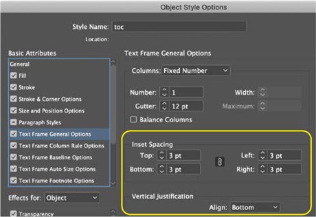
Apply an Object Style to move the text to the bottom of the text frame.
The end result is a style-fest where table of contents styles leverage your use of paragraph styles in determining what is included in the entries. Then, in turn, the paragraph style that is applied to the entry can incorporate a character style, and to finish off, an object style can make the text fall exactly where you want it. If we said we got all this right first time, we’d be lying. There’s some back and forth. When it works, it’s like operating a well-oiled machine; when it doesn’t, just go back to the Table of Contents settings and make whatever adjustments you need to make. Once you get it right, it’s right forever. Thereafter, if the pagination changes, choose Layout > Update Table of Contents, and your numbers update while the text retains all of the formatting you’ve worked so hard to finesse.