
Split-Face Type Portrait
Half man–half letters
The Brief
Combine word and image in a symmetrical type portrait
Trim Size
US Letter/A4
Learning Points
Using Photoshop clipping masks
Setting type in Photoshop
Tools
Photoshop
Fonts Used
FF Good Pro
Inspiration
Every good layout needs a portrait that is half face, half type. What better way to make a boring photo more interesting? We’ve all seen a photo of a handsome face. What about a photo of a handsome face that is peering out at us through a wall of type? Now there’s a layout idea.
Happily, this effect is easy to execute. All you need is a good portrait, shot head on, so that it’s as symmetrical as possible.
I (Nigel) started by cropping the image as necessary, and then I drew a guide in the vertical center of the canvas, dividing the face in two.
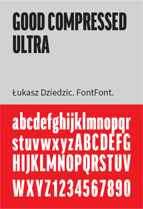
I wanted the type to be solid, something heavy and dense, and not too rounded, so that as much of the portrait as possible could be seen through the windows of the letter shapes. I planned to set the type in all caps to let me fill the most space possible with the type. I selected Good, a typeface family that comes in a massive range of weights and widths, choosing its heaviest, most compressed form.
In the Justification settings, I reduced the Word and Letter Spacing settings to bring the words closer together; and reduced the Auto Leading percentage, bringing the lines closer together. It’s all about making big “type windows” with as little space as possible between the “panes.”
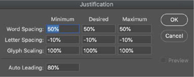
Photoshop’s typographic capabilities are often overlooked. The Justification options let you affect the personality of your type by changing the Word and Letter spacing settings, as well as the auto leading value.
I found that for this to work, the type needs to extend from the very top of the image to the very bottom, as well as be perfectly flush with the left edge of the face. To make this happen, I experimented with size and word breaks. I also found that the eye was crucial to the effect. It was important to let as much of the eyeball, especially the highlight, show through the letter shapes as possible.
Clipping the face to the type
Once the type was in position, I copied the image layer and moved the copy above the type. To clip the layer to the type, I held Option/Alt and clicked the horizontal line between the layers — this causes Photoshop to use the pixels of the lower layer as a mask to hide parts of the upper layer. You can also choose Create Clipping Mask or Group with Previous from the Layers menu to get the same result.

At the bottom of the layer stack I added a solid color layer of white. To mask the right side of the face, I selected the original image layer, drew a rectangular marquee on the left side of the image with the Marquee tool, and clicked the Add Layer Mask button. This reveals the white layer below the photo that is masked with type.
The type may be hard to read, but that’s part of the charm. A reader will see the face jump out first; the words are secondary, but still important. Once the viewer turns their attention to the text, it ought to be neat, orderly, and readable, offering a compelling message.

Mask the right side of the face with a layer mask (A).
Add the text layer above (B).
Duplicate the image layer and clip it (Cmd+Opt+G / Ctrl+Alt+G) to the type layer (C).