Gift or Product Guide
Between structure and chaos
The Brief
Design a gift or product guide that features cutout images of differing scales
Trim Size
US Letter/A4 or any preferred magazine size
Learning Points
Using selection tools and layer masks in Photoshop to isolate images from their backgrounds
Setting up and working with a grid
Designing with hierarchy and white space
Tools
InDesign, Photoshop
Fonts Used
Filson Soft
Inspiration
Every consumer is a bundle of contradictions. When shopping, we want to feel carefree and spontaneous. At the same time, we want to know that the provider is competent, stable, secure. Freedom and limitations, all at once.
That’s why any good gift catalog or lifestyle magazine needs a layout with a solid structure that also includes some wild elements. A consistent grid and clear typographic hierarchy, alongside playful images and plenty of white space.
This sort of layout is a staple of lifestyle magazines — a roundup of products arranged over a page or spread, with a brief description of each and information about how they can be purchased. Here are some fun ways to make it work.
Image treatment
To maximize the use of white space and give the layout an airy feel, the images are cut out, making extra work for the designer. Knowing that we wanted to extract the images from their backgrounds, we made sure to choose images that were not cropped and that were shot against a white or plain background to make masking them in Photoshop easier. The irregular shape of the images is key to providing visual interest. If all the images were rectangular, the layout would look static.
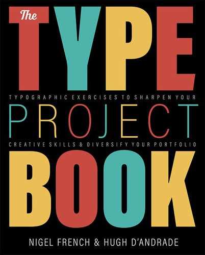
Where the subjects cast a shadow, we included this in the selection to provide some dimension. With the Quick Selection tool active, choose Select Subject on the tool options, refine the selection if necessary, and then convert this to a layer mask. With a soft brush, paint in white on the layer mask in the foreground of the subject to reveal the shadow — or as much of it as you want.

Use fixed color sample points (A) in conjunction with the Info panel (B) and a Levels adjustment (C) to ensure that any white areas that are not masked are pure white.
Mask the background with a layer mask (D), but paint back in the shadow cast by the object (E).

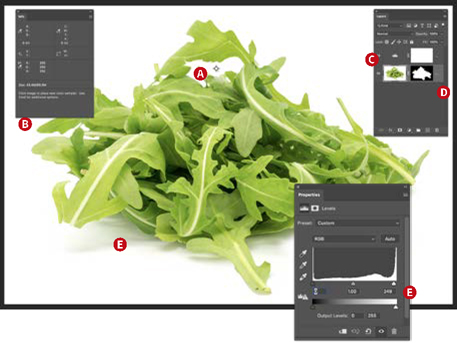
Experiment with staying mainly within the grid for a more subdued look (A) versus scaling up the images, causing them to burst out of their grid fields and interact with each other (B). In some cases the images overlap the columns rules (C), causing the text to wrap around their shapes (D) and even sit behind the text (E).
We used the handy Info panel to verify that the background really was white (255, 255, 255 in RGB numbers). We put down some color sample points, by clicking with the Eyedropper tool while holding the Shift key, and used a Levels adjustment layer to force the light grays to pure white.
Grid
We used a grid to organize the information. The number of grid subdivisions you use is partly a matter of personal preference; we opted for 12 columns and 16 rows — a combination that provides much flexibility but also comes with the potential visual confusion of having many grid lines. At its core, this is a 3-column layout, with the larger items occupying 2 columns and the smaller items a single column. A 12-column grid is a popular choice because it’s divisible by 2, 3, 4, and 6, making it easily adaptable to the designer’s needs and also suggesting layout opportunities.


The layout grid, together with the baseline grid, helps structure the content and suggest layout options. Should it become too restrictive, you can always break it.
Balance and image placement
We placed the images so that they face in — toward the spine — rather than out to the edge of the page. This makes them sit comfortably within the composition rather than looking like they’re trying to escape the page. The spread is balanced with a large image at bottom left and a correspondingly large image at top right, leading the reader’s eye diagonally up and around the spread. To introduce an element of mischief, some images break out of the grid or even bleed off the edge of the page.

Placing a large image bottom left and another top right leads the eye down from the large, bold headline around the spread.
The irregular shapes downplay the fact that the document is created on a grid. Just because we used a grid to organize the content doesn’t mean we want the reader to necessarily notice this. Combining the organic shapes with the structured nature of the page allows you to create a layout that’s fun and dynamic but gives up nothing in terms of hierarchy and readability.
Type choice and treatment

Filson Soft is rounded for friendliness and has a distinctive R.
In this layout, the type plays a supporting role to the images. It does so unobtrusively while at the same time being quietly firm about the hierarchy of information. Bold subheads are contrasted with a light weight of body text. We chose a sans serif family, Filson Soft, in keeping with the minimalist aesthetic of the spread. While many sans serif typefaces are neutral, Filson brims with personality. The letters are rounded, they appear relaxed, and there is a delightful, somewhat eccentric uppercase R. At the same time, it’s very readable due its open shapes and large x-height.
The type alignment is fluid — sometimes left, sometimes centered, sometimes right — with the text “leaning in” to its associated product, helping establish the visual relationship between each item and its description. Although long passages of center- or right-aligned text are seldom advisable, it works here because the descriptions are short and because the alignment plays off the position and shape of its associated picture.
We shaped the line endings with forced line breaks (Shift+Return) — both to improve readability and to provide pleasing shapes. For centered paragraphs we aimed for a chandelier shape. It’s important that these paragraphs look intentionally centered, rather than almost left aligned or justified. Similarly, with right-aligned paragraphs we made our intent clear by avoiding lines that were very long or very short. Because we’re working with short bursts of text, we turned hyphenation off.
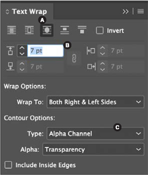
To allow text to wrap around a cut-out image, select the picture frame and choose Wrap Around Object Shape (A). Set the offset amount (B). From the Contour Options, choose Alpha Channel (C) to use the shape of the layer mask added in Photoshop to create the wrap shape.
We also took care to make sure that the baselines of type in side-by-side columns were aligned and that they finished on the same line, providing a solid foundation to the spread. To do this, you can employ a baseline grid, although with a limited amount of text, this can be done by eye.
Even though there are only three styles of paragraph, it’s crucial to use paragraph styles: Not only will it make the formatting faster in the first instance, it gives you the creative leeway to make global adjustments to the spread by editing the style definitions thereafter.
Column rules
This layout relies upon the tension between chaos and organization. While the images want to bust out of their allotted space, the column rules tie the composition together and remove any ambiguity about what piece of text accompanies what image. Recent versions of InDesign allow you to add common rules between multiple columns of a text frame. But in this case, because each item is independent, you’ll need to draw the column rules manually. To prevent moving them by mistake once in place, add them to their own layer. Optionally, create an object style for the rules to make it easy to change the weight or line style globally should you need to do so.