
Letterpress Gig Poster
Grooving with moveable type in the 21st century
The Brief
Design a letterpress poster
Trim Size
13 × 19 inches (330 × 483 mm)
Learning Points
Learning letterpress basics
Producing a poster virtually overnight
Creating color mockups in Photoshop
Tools
Vandercook Press, moveable type, Photoshop, linoleum blocks
Fonts Used
American Wood Type (various), Futura, Walbaum
Inspiration
www.bl.uk/collection-items/the-diamond-sutra
wikipedia.org/wiki/Hendrik_Nicolaas_Werkman
In 2019, I (Hugh) had the chance to design a poster for one of my favorite bands, the Pixies (currently playing on the clever pseudonym “Pixies,” no “the”) in San Francisco. However, due to a miscommunication, I didn’t have enough time to do a proper silkscreen project with my usual printer — and I was in despair. Luckily, my friend Alastair Johnston offered to step in and help me do it in a day using letterpress.
Alastair is a legendary man of type. Nigel and I both studied with Alastair at the University of California at Berkeley Extension program in the 2000s. He’s the owner of Poltroon Press in Berkeley, where he has been creating beautiful, limited edition printed works since 1975. He’s a scholar of design, typography, printing, and art, as well as African popular music. He was an early consultant to Adobe when it first began issuing digital fonts. A true renaissance man!
Letterpress is a method of printing that goes back to the 15th century, as direct and intuitive as printing can be: Type and images are cut from metal or wood, rolled with ink, and impressed onto paper. It was the dominant form of printing for centuries, until the invention of the offset lithography.
Needless to say, I jumped at the chance to do a project with Alastair. Time was tight, but I knew we would at least have fun, and I would learn a lot. I showed up at his Berkeley print shop with my sketch in hand. I was immediately overwhelmed by the sheer wealth of material in his shop! It’s packed to the gills with posters, handbills, books, cases of wood and metal type, records — a rich tapestry of inspiration and history.
As a digital native, I always find myself marveling at traditional printing methods. I love the way archival print looks, feels, and smells — but I’m sadly ignorant of how it all unfolds. To realize my sketch, I required a lot of hand-holding from Alastair to walk me through the process.
We started with the title treatment I wanted to try: a multitude of American wood type letterforms, set askew, in multiple rotations. Alastair scratched his chin a moment — it would be easier in letterpress to set the type in horizontal and vertical formats — but he seemed to take it as a challenge.

Choosing the type
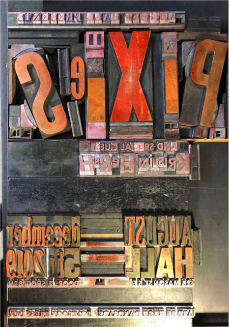
While I worked on cutting my illustration out of linoleum block, he set about building the lockups. Lockups are tight, carefully assembled arrangements of type that use blocks of wood, called furniture, to create a secure unit of type that is ready to print. (You don’t want the type to wander or shift while it’s on the press, under hundreds of pounds of pressure.) He used a classic typeface, Walboum, for the all the small type, and Futura for the opening act. For the band name and the venue and date, we chose a selection of wood type he had kicking around his shop (there’s a lot of wood type kicking around his shop). This took a while, but when it was done, it was indeed a work of art: blocks of wood type and spacers, all tightly fit together like pieces of a puzzle.
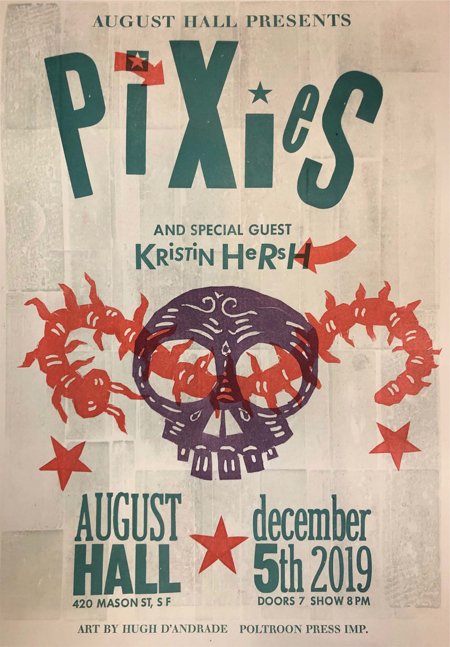
I told Alastair I like the rough aesthetic, the imperfections, of letterpress. He suggested we try a technique pioneered by H.N. Werkman (1882–1945), an experimental Dutch printer who was active during World War II (and who used his print shop to print fake documents for the Resistance). Werkman had a habit of using the furniture (those wood block spacers) in his shop to create interesting designs. So for our poster we made a large rectangle out of the furniture, placed it on the press bed, and inked it up to create a background texture.
Cranking up his trusty Vandercook proof press, we ran 100 posters through by hand in no time. (Well, it did take some time, but not as much as you might think.) Then, turning to the type, we secured all the type lockups into the bed of the press, and when it was aligned properly — after many test proofs — ran the sheets through again, mixing the color as we went to produce a deep green shade.
I photographed a proof of the type treatment alone. In Photoshop, I reduced that to black and white and then applied color in different layers to create mockups, trying several colorways.

H.N. Werkman Composition with Letters, 1927
When we returned to print the images, the colorways really helped by providing a guide for what we were aiming for. Nevertheless, we still had to make several color adjustments — cleaning and re-cleaning the press several times — to get the right look. We had several pieces to print in red: stars and arrows and a giant centipede I had cut out of linoleum. Finally, for the last pass we printed another image I cut, a stylized skull shape, using a deep shade of purple.
The end result isn’t bad for a two-day job! Printing this way, on a press several times older than my oldest laptop, using type that has been passed down from generation to generation, is a fun, challenging, and rewarding project for any designer.

Some of the colorway mockups Hugh created in Photoshop. Doing color sketches this way saves a huge amount of time, since cleaning the press is tedious and time-consuming.

Hugh’s pencil sketch was rough, but provided a guide for how the final ought to look, as well as all relevant details, carefully proofed.
The lockup, with the wood and metal type carefully placed and tightly constrained, ready for printing. The letters are all raised to the same height, and when the ink roller passes over it, the ink will cover it evenly. It is then pressed into the paper, making a (hopefully) perfect image.
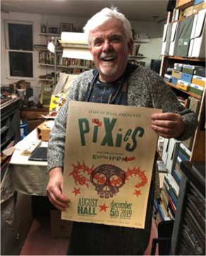
Alastair holding a copy of the finished Pixies poster, at Poltroon Press in Berkeley. A total of 100 posters were produced, and each one was signed and numbered for the event.
Q: Can you tell us briefly about letterpress — how old this technology is and its source?
It’s a relief printing process that goes back as far as mankind started making marks. Before Gutenberg (1450) there was block printed wallpaper and playing cards in Europe, and blockprinting of religious iconography in India and China. The oldest books are block printed copies of the Diamond Sutra.
Gutenberg was a metal worker who came up with the idea of reusable letters that could be interchangeable, a step along from stamping a maker’s name into a silver plate, for example, which used the same technology: a punch. He figured out how to create a matrix and then cast metal into that mold to mass produce letters.
Q: You produce everything from posters to broadsides to entire books in your shop. Do you really set every letter by hand?
Now most of my books are done by offset and composed on the computer, but I do enjoy setting books by hand. Currently I am working on a poetry book by Paul Celan (translated by Ben Friedlander) which is handset.
Q: What are some the advantages of letterpress printing compared with other methods?
For me it’s the control of every aspect of the process; once I get the work on the press and look at it, I can make minute, almost invisible, changes to my heart’s delight. This may sound trivial, but the aim is a perfectly set page, which you cannot do with computers.
Q: Anything else you’d like to add?
When I started out in the 1970s an old-timer said he would sometimes set a letter upside down so people would realize it’s handset. I thought that was the screwiest notion ever, but now I think that it’s nice if there are telltale signs, like a worn character, or one slightly misaligned, which most people miss, but experts can spot as the result of handsetting.