
Menu
Design a menu for your favorite restaurant
The Brief
Create a menu (front and back) for a real or fictional restaurant/café. The document should be constructed so that it can be easily edited by someone with only basic InDesign skills. Because it will be printed on a desktop printer, no bleeds are allowed.
Trim Size
US Letter/A4
Learning Points
Establishing hierarchy
Working with inline frames
Using best practices for easy editing
Tools
InDesign, Illustrator
Fonts Used
English Grotesque, Clarendon Text
Inspiration
Imagine you’ve finally gotten reservations at the hot new restaurant in town. You and your date sit down to order, and suddenly you’re stopped cold. The menu is horribly designed, with clashing typefaces and poor letterspacing. There’s no way to easily distinguish the main courses from the appetizers, and the descriptions of the dishes are set in type that is impossible to read without a magnifying glass.
Horror of horrors! You’d be forgiven if you gave up your reservation and rushed home to prepare your own meal, complete with a handsome menu.
Designing a menu brings up many common design considerations, including page size, font, and color choice. There is also the challenge of how to present a large amount of information in a finite amount of space — in a way that is both appealing and functional.
For this brief, we invented our own fantasy restaurant, one that serves some of our favorite dishes and beverages. The restaurant has an informal, shabby chic, eclectic vibe that we want the menu to reflect and promote. It is a wooden-floor, comfy-seats, not-too-brightly lit, not-too-loud kind of place that offers an unhurried dining experience that won’t break the bank.
As with any project, start by researching how others have solved similar problems; look at other menus, especially from competing establishments.
Type choice and document setup
Because nostalgia is an important motivator when it comes to food, we chose a vintage design vibe that evokes a past era (probably one that never existed) when food was fresher, healthier, and tastier. The slab serif Clarendon also has the advantage of being easily read in the restaurant’s romantically lit booths and corners. The green used as an accent color reinforces the healthy, natural theme.
Restaurant-goers expect a menu to follow a basic format. Now is not the time to conceptually and visually challenge your audience. The item descriptions should be short and unpretentious — but enticing enough to make a guest’s mouth water. We put the restaurant logo and name at the top of the menu. The logo is created in Illustrator so that we could add the shaded and extruded shadow — an effect not possible in InDesign. The hierarchy is unambiguous, with the menu broken into clear sections — starters, mains, desserts, and so on. Because space is tight, the limited white space is used carefully to organize the information and guide the reader.
Budget and practical considerations must also be taken into account. How often will the menu be updated and by whom? Our menu was designed to be printed on an office laser or inkjet printer so that it can be updated as needed, daily if necessary. For this reason, there are no elements that bleed to the edge of the page. Clearly named paragraph styles include all the necessary text formatting. Along with the logo, address, and opening hours, the page frame and inter-column rules are on the master page, and so implicitly locked and safe from harm when the document is updated. As well as the print version, a PDF can easily be output for inclusion on the restaurant’s website.

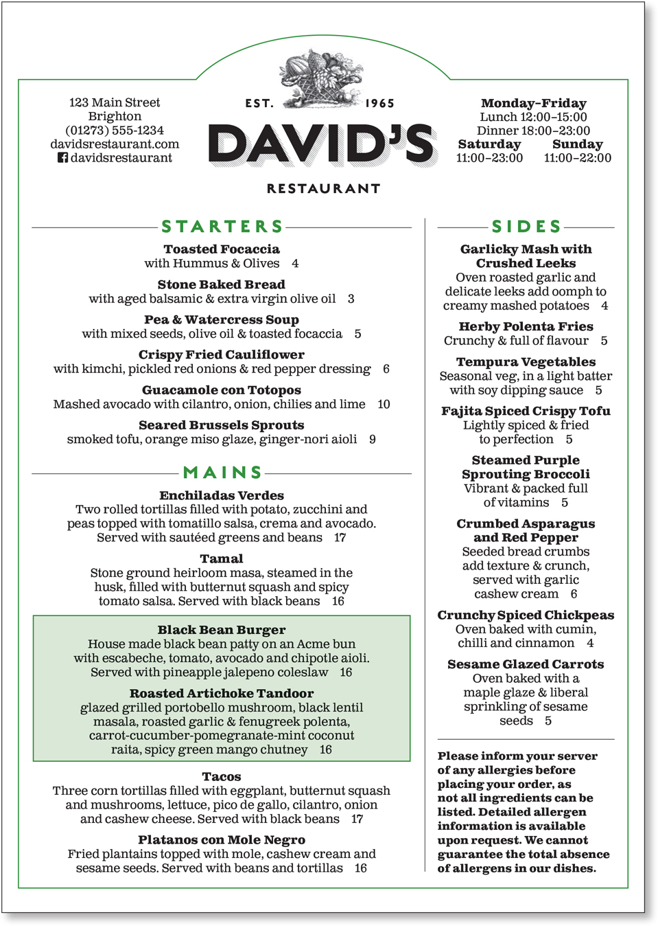
We chose a standard US letter (or A4) size because it’s easy to hold and easy to reproduce. The menu will be updated regularly — and not necessarily by an InDesign whiz — so the document’s construction should be as transparent as possible and the required materials as available as possible. We resisted the use of potentially confusing nested styles and the need for origami folds. The color palette is limited — in part for the same reason, but also because black-on-white text provides the best contrast, especially in a dimly lit environment and, not least, because simpler is better.
To add visual and tactile appeal, the menu will be printed on an off-white, lightly textured paper, and presented on a clipboard.
Text formatting considerations
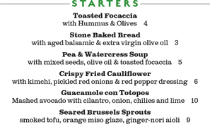
Like so many projects, the menu challenges us to cram in a lot of information and make it look good. While run-in heads for the menu items would save space, the information would not be as clear, and the formatting of the text would be fussy. For readability, the text is in upper- and lowercase, and we’ve used ampersands to save space — and because everybody loves ampersands. The center alignment of the text creates even white space either side of the line and prevents visually jarring long and short lines in the same paragraph; I turned on Balance Ragged Lines in Indents and Spacing. Hyphenation is turned off. While hyphenation is a necessary compromise with prose, it has no place on a menu.

The menu is created on a 12-column, 5-row grid. The layout grid is added on the Master Page using Layout > Create Guides.

The text is center aligned, creating equal white space either side of the paragraph. To avoid long lines and short lines (A), Balance Ragged Lines is included in the Paragraph Style definition (B). Hyphenation is turned off.
To make the document easier to edit by someone with basic InDesign skills, we made each section its own text frame. The frames are set to auto-size (height only, from the top) to minimize any confusion about possible overset text. Using a layout grid means each frame can be docked into place on the page, fitting together like a jigsaw.

Setting the text frames to auto-size avoids the recurring problem of text becoming overset. It also keeps your layout tidy because the text frames will be only as big as they need to be to accommodate the text.
Spacing and hierarchy
With so much information, it’s vital to use the limited white space purposefully. Each item is preceded with a consistent amount of space before, which is incorporated into the paragraph style definition. Rules help to organize the information into sections. To frame the page, a rectangle is combined with an oval using the Pathfinder Add to make an arch. The section heads have rules either side of the text. This is created with a paragraph rule below. So that the rule doesn’t slice through the text itself, a paragraph rule above that is the same color as the paper is also added to provide the white space padding around the text.

The proximity is vague. The dish names are closer to the description of the dish above.
The relationship between the dish title and its description is reinforced by the spacing.
Starting with a Template
There are some perfectly serviceable, free InDesign menu templates available if you scroll down in InDesign’s New dialog box. If you’re in a hurry or if you just like the look of these templates — these can be a good starting point. You’ll also find paid templates at design resource sites like Creative Market and Graphic River.
A common device on menus is to use shapes and/or shading to bring attention to certain items. We called out the daily specials in a tinted rectangle. We originally tried this with a combination of Paragraph Borders and Shading, but found it too fussy, so opted instead to make these into inline objects, which are set to auto size according to the amount of content.
In presenting the prices of the dishes, I’ve omitted the currency symbols, both to save space and because the customers know what currency they will be using. Tempting as it is to align the prices to the right so that they can be easily scanned, we chose instead to offset the price with just an em space (Cmd+Shift+M/Ctrl+Shift+M). This helps the guest to focus on the food rather than compare prices. This might seem like a cynical ploy by the restaurant to bury the price, but its intention is to draw focus to the dish rather than its cost. There is a psychology around numbers, with prices ending in 99 suggesting value, but not necessarily quality, while those ending in 95 apparently suggest friendliness. Our fantasy restaurant has no need for such fussiness or pop psychology, and so all the prices are rounded — down rather than up.
Some line art adds visual interest and a vintage feel. Because pictures of dishes are more suited to a diner or fast-food joint, both for aesthetics and for ease of reproduction, there are no photographs.
While “David’s Restaurant” exists only in our heads, whatever sort of menu you’re designing, you will face similar design considerations. Make sure that your font and color choices reinforce the restaurant’s image. The menu design should complement the style of the restaurant, and the text should be both easily editable and readable. Squinting while holding the menu at arm’s length is not a good look for the customers — although sharing reading glasses could be an icebreaker on a first date.
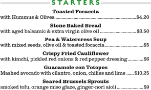
Dot leaders between the item and the price look over formal. The currency symbol is repetitive and unnecessary.
The prices are rounded for friendliness and simplicity; all clutter is removed.