
Magazine Cover
Where flyaway hair and masthead meet
The Brief
Create a classic lifestyle magazine cover where the model’s head (and flyaway) hair are entwined with the masthead
Trim Size
8.375 × 10.875 inches (213 × 276 mm)
Learning Points
Creating a complex mask in Photoshop
Sampling colors from the image
Using hierarchical Based On styles
Tools
Illustrator, Photoshop, InDesign
Fonts Used
Bodoni 72 Bold Rift Soft
Inspiration
The model strikes a powerful pose, and her hair flutters in the breeze. The masthead hovers behind her, and somehow, the tiny wisps of hair seem to wind and curl perfectly around the letters of the masthead.
We’ve all seen this technique used a thousand times, but we never tire of it. Perhaps we just love to see hair and type interact — or perhaps we just enjoy tormenting the designers whose job it is to make this work, time and time again. There are several ways to do this. This is the approach we took.
Create the masthead/nameplate
First off, it may be a bit pedantic, but what we’re actually talking about here is the nameplate. The “masthead” is the bit on an inside page where the publisher information goes. However the (mis)usage has become so common, that we’re going to go with it.
In Illustrator, in a document that is the width of the live area of the magazine, set the type, and adjust the tracking and kerning as necessary. We used Bodoni 72 Bold, a revival of the classic Didone typeface designed by Giambattista Bodoni in the late 18th century. It’s a popular choice for luxury brands. Pay attention to the kerning between the V and A and adjust accordingly.
Having saved a copy, convert the type to vector outlines (Type > Create Outlines). This removes any potential for missing font messages down the line and also ensures that the masthead type is treated like a logo from here on. (Yes, you could do this in Photoshop, we just feel more at home in Illustrator when working with type.)
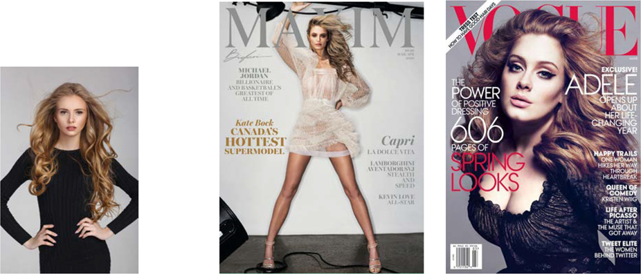
The original stock image (below) and a couple of contemporary examples of flyaway hair/masthead combos

In Photoshop, open the picture of the cover model. Crop and adjust color, tone, and contrast as necessary. Do this non-destructively: Delete Cropped Pixels on the Tool Options should be deselected; use Adjustment Layers. Choose File > Place Linked to import the masthead on a layer above as a linked graphic.
Prepare the image
The success of this technique depends in large part on your choice of image. We chose an image (from Shutterstock) where the model is shot against a contrasting flat-color background. It is this that makes it possible to isolate the model’s head and shoulders with relative ease. It’s less about the amount of hair and more about the amount of edge contrast.
In Photoshop, use the Marquee tool to make a selection of the top fifth of the image — make sure you’re including the area that covers the masthead. Press Cmd/Ctrl+J to copy this selection to a new layer. Move the new layer above the masthead. On the Tool Options bar click Select And Mask. In the Select And Mask dialog box, set the View Mode to On Layers. To mask the background, choose Select Subject. Now switch to the Brush tool and click the Minus behavior and paint over the stem of one of the letters (in our case, the U) to make it look like the strand of hair is going behind the letter. Depending on the nature of your image, you may need to use the Refine Edge brush to finesse the selection. To remove any fringing around the hair, check Decontaminate Colors and from the Output To list choose New Layer with Layer Mask. Click OK when you’re happy with the result. Your original copy of the layer is now obsolete, and you can delete it.

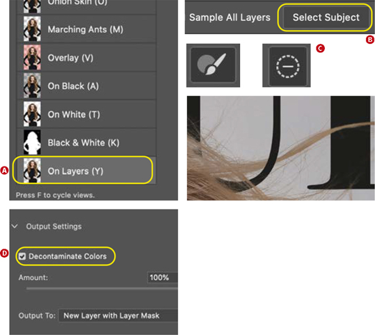
Choose On Layers to see the cutout in context (A).
Choose Select Subject to make the initial selection (B).
With the Brush tool in minus behavior paint over the hair where it overlaps a letter to remove it from the selection (C).
Choose Decontaminate Colors to remove color fringing (D).
The essence of this technique is that you have two copies of the image: one below the masthead and one above. The copy above the background is masked to reveal the type layer sandwiched between the two image layers.
Add the type
With the image prepped, place the PSD file in InDesign to add the cover type. To create tight and compact blocks of type, we used uppercase. To occupy more vertical space, our chosen typeface, Rift, is condensed. And because we also wanted the type to be friendly, we opted for the rounded version, Rift Soft.
In InDesign, create a series of hierarchical styles using the Based On feature. We made three styles: Large, Medium, and Small. Large is the parent, Medium is based on Large (smaller and using a different color), and Small is based on Medium. Any changes made to the parent style will also affect the offspring.
To make it easier to experiment with the type and leading values, we used Auto Leading, but changed the relative size of the Auto Leading in Justification settings to less than 100%. Exact mileage will vary according to the font you’re using and your personal preferences, but we’re looking for tight line spacing to build density with the type.
As well as the leading, we also adjusted the Word Spacing and Letter Spacing settings, reducing both from the their defaults of 100% and 0, respectively. Again, the exact amount you use will depend on the properties of the font you are working with.
Sculpt the line endings as necessary with line breaks (Shift+Return) to ensure that you enhance the meaning of the text and don’t obscure too much of the image.

Word and Letter Spacing
You can really affect the personality of the type by adjusting the Word and Letter Spacing. The values shown here will give a tight, dense look — but experiment with your own. When you’re working with type that is left, center, or right aligned (i.e., not justified), only the Desired column has any effect. That said, InDesign won’t let you make the Minimum more or the Maximum less than the Desired.
Choose colors
Let your choice of type color be suggested by the image itself. The Color Theme tool lets you create color palettes — or themes (a group of five related colors) — based upon a chosen color harmony rule. This is a good starting point, and if you’re not confident about choosing colors, it provides reassurance that you are proceeding with a methodology rather than just randomly picking colors.

With the Color Theme tool you can create a color palette from the image. This can be added to your Swatches panel (A) and/or your current CC Library (B).
Alternatively, you can sample colors manually with the Eyedropper tool, and this is the approach we took, sampling the lipstick, the fingers, and the eye color.
Remember that the point of this design trope is to hide the masthead. Your magazine is so famous, so iconic, that the public doesn’t even need to see the entire name. But to make it work, that flowing hair needs to look natural, as if the model just happened to be captured standing in front of the actual masthead.

All it takes to create the illusion is a simple layer sandwich and a decent layer mask.