
Environmental Alphabet
Find letters in everything
The Brief
Create an alphabet inspired by shapes in nature and the human environment
Trim Size
Tabloid/A3
Learning Points
Photographing type
Understanding the importance of cropping
Being observant
Tools
Lightroom Classic, Photoshop, InDesign, Camera
Inspiration
A one-of-kind billboard: vimeo.com/41171412
They say the human mind is primed to find patterns in chaos. If you work with type, the most important patterns in the world are letterforms, and not surprisingly, they are everywhere — even in the sidewalk! Once you recognize a perfect question mark in a bale of hay, or an R in the shadow cast by a branch, you’ve fallen down the rabbit hole.
It’s a mixed blessing. On the one hand, the world is a typographic playground. On the other, you may have contracted a mental condition that doesn’t yet have a scientific name.
Like several of the projects in this chapter, this project is a slow simmer — one to be completed while you’re working on other things. With a camera, some careful cropping, and some basic digital darkroom techniques, you can tease out letter shapes from your environment, compiling them into whole “accidental” alphabets.
It will take a while to find all the letter shapes you need. Think of it as a protracted treasure hunt. (Note: We find it’s best to keep this habit to yourself, as non-designers find the practice to be both bizarre and a little annoying.)
Building your collection
Once you’ve begun obsessively collecting photos of serendipitous letters, you’ll need to have a way to store them over time for later use. In Lightroom Classic, or Bridge, or wherever you store you images, you can make a collection, and if you like, you can set up a Smart Collection — this way, any image tagged with a specific keyword automatically becomes a member. That’s a fine method, but for this project I (Nigel)chose to create a regular collection, which allows me to drag the images into alphabetical order (something you can’t do with a Smart Collection). This way, it’s easier to figure out which letters I still need. Over the course of time, the letters accumulated until they reached a critical mass of being a near-complete alphabet. At that stage, I searched more proactively for the missing pieces.
That B you discovered in a shadow, or the Q that appeared in a swirl of marble, may be perfectly obvious to us. But remember that your audience may be inexplicably less attentive to letterforms, so you’ll need to pull out all the stops to draw the viewer’s attention to the shape that you want to emphasize.
You’ll want to season to taste, but for me, this means in Lightroom Classic increasing the contrast, pumping up the Texture, Clarity, and Dehaze sliders, as well as moving the Blacks slider to the left and the Whites to the right. Consider adding a vignette to darken the edges (and so draw the viewer’s eye to the center of the image). You can also use the Adjustment Brush to dodge and burn (lighten and darken) specific areas of the image.
A wonderful reminder that art is everywhere if we open our eyes to it, Urban Decay: A Conceptual Typeface is an “accidental alphabet” by Jason Ramirez www.behance.net/jasonramirez.


Use a zoom lens to collapse perspective. Use cropping to emphasize the letter shape. This image of a path was a candidate for the letter B, which I ultimately did not use. It would perhaps make a good 3 if I ever extend the project to numerals.
Create a Publish Service in Lightroom Classic
Although you can just export the images from Lightroom Classic, this workflow is a one-way street. If you create a Publish Service, however, you can more easily manage updates to the letters. For example, I started out with color images, but soon realized that because the pictures varied greatly in their lighting conditions that the alphabet as a whole lacked cohesion. To address this, I converted the images to black and white. An easy fix in Lightroom Classic: I applied a black-and-white preset and then republished the images through the Publish Service. This, in turn, required me to update the links in InDesign; the good news is that all images update in place.
Making the grid in InDesign
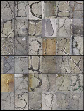
There’s no right way to present the alphabet, and if you look at how others have approached the same problem, you’ll find a variety of interesting solutions. Here’s my approach: Start with the margins set to zero. Divide your page into a 6 × 9 grid. The outermost grid squares function as a generous framing margin, leaving you with a 4 × 7 grid, for a total of 28 squares. Obviously that’s two more than you need for an alphabet, so you can fill the remaining two squares with any interesting punctuation you find. Extra credit if you also include numerals, for which you can use a 6 × 6 grid. Set the fitting options of the frames to Fill Frame Proportionately, and crop each image as needed.
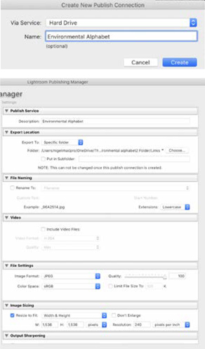
Setting up a Publish Service in the Lightroom Classic Publishing Manager
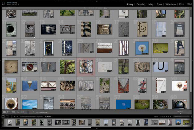
Nigel’s Lightroom Classic collection in progress; the images are arranged alphabetically so that I can better assess what’s working and what’s not.
Adding color
To tie the composition together, I chose a limited color palette of three colors with similar value, that is, relative lightness or darkness. Next, I duplicated the layer, switched to the Select Content icon and deleted the images, leaving me with empty frames positioned exactly where I wanted them. I filled the frames with color and blended them with images below by using the Effects panel. I chose a blending mode of Soft Light and an opacity of 50%, but you’ll need to adjust this according to the nature of the images you’re using, the colors you’ve chosen, and your personal taste. Note that the blending mode’s result will vary according to the transparency blend space. Because I intended to print the piece on my inkjet printer, I used Document RGB.

Create the grid, with no gutters, fitted to the page (A).
Leaving the outermost grid square as margin, draw a frame over the interior 4 × 7 grid. As you draw the frame, press the Up Arrow to add rows, and the Right Arrow to add columns.
Select all 28 frames and set their fitting (Object > Fitting > Frame Fitting Options) to Fill Frame Proportionately (B).

To keep things consistent, I created three object styles with solid fills, one for each of the colors. Using object styles makes it easier to experiment with different colors, because once they have been applied, all you need to do is change the object style definition — in this case the color and/or blending mode — to transform the composition.
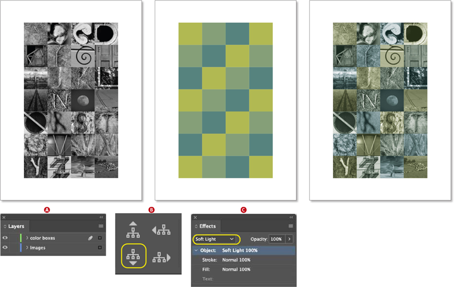
After duplicating the layer with the images, choose the Select Content icon and delete the images. Fill the remaining frames with color, and then experiment with the blending modes on the Effects panel to combine the color with the monochrome images below.