
Magazine Layout
Create a six-page magazine feature article
The Brief
Create a six-page magazine feature article combining text, pictures, call outs, and captions, and making effective use of white space
Trim Size
8.375 × 10.875 inches (213 × 276 mm)
Learning Points
Designing with a layout grid
Understanding the importance of paragraph styles
Working with captions and sidebars
Tools
InDesign, Photoshop
Fonts Used
Tisa, FontAwesome
Inspiration
Along with book design, magazine design is a fundamental typographic skill. Every graphic designer needs to be comfortable setting up and working on magazine layouts — otherwise, we’d have to admit that print is dead, and we’re not ready for that.
For most magazine work, you’ll be working with an existing template that incorporates the paragraph, character, and object styles, as well as the color swatches, and the layout grid. But for this project, let’s imagine that we’ve been assigned pages 48–53, and the template is ours to build. (Perhaps the art director has run off to join the circus, and now we’ve been put in charge — free at last!)
Choosing and formatting the type
We used FF Tisa by Mitja Miklavčič, a contemporary slab serif that’s highly readable, is available in a wide range of weights, and has a supporting sans serif in Tisa Sans. Because of its large x-height, we used a slightly smaller size than we might typically. In this project, we paired 9.5 pt type with a leading of 11 points. This formula of between 1 and 2 points extra leading works well for most magazine body text.
Because Nigel likes symmetrical text blocks, we used justified type, with the paragraph differentiated by a one em first line indent; or to put it another way: a first line indent that is the same size as your type. To create a steady rhythm to the type, the text is aligned to the baseline grid.
Working with justified type, it’s especially necessary to customize the Hyphenation and Justification settings to avoid gappy text (see the project “Fiction Classic: Design a novel with continuous text flow”). We also turned on Optical Margin Alignment (Type > Story) to push any hyphens or any punctuation at the end of the line slightly beyond the edge of the text frame to sharpen up the justified edge.
To prevent paragraphs from ending with a short last line, we added a GREP style that applies a No Break character style to the last eight characters of a paragraph.

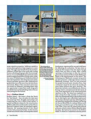
Working with a floating column
This project used a common and effective technique of working with a floating column. We had a 10-column layout grid, with each of the text columns 4 grid fields wide. The floating column is the width of 2 grid fields and can shift its position relative to the text columns — sometimes on the outside edge, sometimes between the two, or less often, but still possible, on the inside margin. The floating column can be used for captions, white space, or straddled by an image. Working this way requires separate threaded text frames for the text, because you can’t treat the narrow column as a gutter and shift its position relative to the text.

Combining text and images
Where images are grouped together, make sure the horizontal and vertical gutters between them are the same.
When continuing images to the edge of the page, be sure to extend all the way to the bleed guide — set at ⅛ inch outside the page trim (unless instructed otherwise by your printer) and displayed in red. Images with a lot of sky make good candidates for bleeding to the edge, giving a more expansive look to the image. At the same time, bleeding an image to the edge will deprive it of its framing rectangle of white space. There are no definitive right or wrong answers, so be prepared to try both options to see what works best.
Where possible, combine the rectangular images with cut-out images, to break up the boxiness of the spread. Or consider different picture frame shapes.
Sidebars and captions
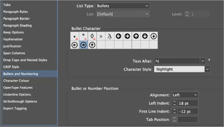
Sidebar text makes a magazine layout more varied, and the addition of short, snappy prose in a box can keep the reader engaged. Sidebar text should contrast with the body text, so it’s clear that it’s a different sort of content. At the same time, there should be stylistic continuity — you don’t want the fonts to clash, like that time you wore a striped shirt with plaid pants. Many typefaces have matching or related versions, and that’s the case with Tisa: We set the sidebar and caption text in the bold weight of Tisa’s cousin, Tisa Sans. The bullets were formatted with the Bullets and Numbering dialog box, and include a character style that assigns a specific character (an arrow from Font Awesome) and color to the bullet itself. The bullet paragraph is a hanging indent — indented on the left, but with a negative first line indent.

The floating column used for white space and captions
The heavy rule on the left side of the sidebar frame is a paragraph border and so will move and resize dynamically with the text.
To make the sidebar less “boxy,” we sliced off its top-right corner. For the corner sizing shape options, with the chain broken, we chose a bevel of 18 points for the top-right corner.
Once you have a prototype sidebar looking how you want it, capture its formats as an object style. Because the sidebar text follows a predictable sequence, we incorporated the paragraph style and Apply Next Style as part of the object style definition. If you’re working on other pages in the magazine, you’ll now be able to apply object and text formatting with a single click. Another approach is to put a copy of the sidebar in a CC Library, and, the next time you need a sidebar frame, just drag that onto the page and replace its contents.
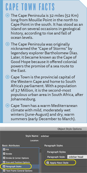
Save the sidebar frame as an object style incorporating Paragraph Styles and Apply Next Style. This will allow you to apply multiple formats — the bullets, the border, the frame color, corner options, and auto-sizing to name but a few — with a single click.
Where the captions are positioned over an image, the fill color (white) is reduced to an opacity of 85%, allowing a hint of the background image to show through. InDesign lets you change the opacity of the fill, the stroke, and the text independently, so make sure it’s only the fill you are changing. The text should remain at 100% so that it’s readable. Also, position the caption over a non-busy part of the image, like a blue sky, so that the caption is still readable.
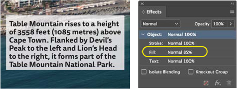
Set the Fill opacity and the Text opacity independently to allow a suggestion of the image behind to show through.
Capturing all these formats: the paragraph, character, and object style may seem laborious first time round, but every time you do, you are creating formats that can be reused again and again. The more you do this, the more time you will save by using styles, so if you’re in it for the long haul, it’s worth investing the time to get familiar with how styles work. Not only will your documents look better, but you’ll save yourself, days, weeks, and months of your valuable time.