
Typographical Logo
A new logo for a venerable institution
The Brief
Create or redesign a logo for an established organization. Make it modular, so it can stack in various ways, with multiple color options, within a consistent brand.
Trim Size
Scalable
Learning Points
Incorporating type into a logo
Building a logo system
Setting limits for logo use
Responding promptly to emails from strangers
Tools
Illustrator
Fonts Used
League Gothic
Inspiration
Hugh works as Creative Director for the Electronic Frontier Foundation (EFF), whose mission is to defend civil liberties in the digital world. By 2017, the original EFF logo was badly in need of reimagining, and Hugh had the opportunity to work with the world-famous branding agency, Pentagram, on a revision. Hugh and Nigel explored this project in conversation, along with more design tips for any logo project.
Nigel: EFF got a new logo in 2018. How did that come about?
Hugh: It’s an interesting story. The blogger behind the fantastic McMansion Hell blog, Kate Wagner, was facing legal threats over her use of real estate photos without permission. One of her supporters was the famous logo designer, Michael Bierut, who offered to pay her legal fees. EFF ended up providing her the legal support she needed pro bono, and this inspired Michael to reach out and offer his own pro bono services to us. (Put another way: He visited our site, loved our work, but saw immediately that we needed a new logo!)
N: So the old logo was that bad?
H: I’m afraid so. EFF had had the same logo since its founding in 1990, and although it was recognizable in the digital rights world, it had some real problems.
For one thing, it wasn’t very legible — it was hard to read the acronym “EFF” in it. And it was awkwardly shaped — hard to center and hard to create a satisfactory lockup (the logo and name combined into one unit).


The original EFF logo had been around since 1990. It was beloved by some, but reviled by designers who had to create a lockup for it.
But most importantly, we began to feel our old logo didn’t stand up well to other logos in our space. In coalition campaigns, we place all the organization logos alongside one another, and the old logo always seemed too busy, too faint, too hard to read. We wanted something that would stand out next to logos for ACLU, Freedom of the Press Foundation, Fight for the Future, and others.

N: Did you try designing a new one yourself?
H: Yes, and I found I was too close to it — too tied into the org and too familiar with the incredibly complex issues. I knew that a project like this required an outsider who could look at the problem with fresh eyes, and not be so encumbered by information.
N: So Michael Bierut wrote you out of the blue? That must have been surreal.
H: It was! I got an email with the subject “offer.” You know how when you see a famous person’s name in your inbox, you know it must be spam? That’s what I assumed, figuring this was an AIGA email. But the email was a short, friendly offer to create a logo for us. Finally!
N: How did things go from there?
H: The whole process took us almost exactly a year, start to finish. Michael and the whole Pentagram team were a pleasure to work with. Their first submission had multiple excellent options, and from there we selected three designs to pursue, then narrowed that to two, and with adjustments at each stage, we finally chose one that worked. All the designs were great — it was a very hard choice.
N: What was it about the final choice that you liked?
H: This logo was nicknamed “Insider,” for the way the organization name was slipped inside the acronym. We loved its boldness. As part of our brief, we had explained that were looking for something that matched the boldness of our vision, something strong and forthright.
Secondarily, the modularity of Insider was incredible. Pentagram are famous for designing logos that aren’t singular images, but rather function as “logo systems” — designs that can be endlessly remixed and reorganized for various purposes. This logo had that quality.
N: So the logo doesn’t really illustrate the idea of digital rights, does it?
H: Nope. Most logos don’t illustrate, they suggest. They function as symbols that we, the fans and supporters, invest with meaning over time. They have to be well crafted, and they have to be evocative and powerful, but it’s not necessary that people look at the logo and think “ah, digital rights.”
That said, most people hate new logos. We got plenty of hate mail from supporters, one of whom said, “I also can provide a typeface and a solid color on request.” Even some of my colleagues preferred the old logo! But we have pushed forward, and the new logo has been very successful.
Pentagram noticed in their research that we really own the letters EFF. There’s a political party in South Africa with the same acronym, there’s the Edinburgh Fringe Festival and a few other, obscure groups, but that was it. So they proposed making these three letters sit center stage.
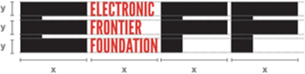
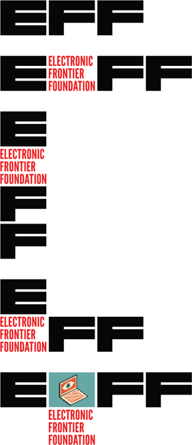
The consistent X and Y axis on each block of the EFF logo allows it a modularity that’s unusual for a logo. It can stack vertically, be formed in a L-shape, or have an image dropped into the middle of it.

Two of the draft logos produced by Pentagram for this project. Both are beautiful and would make fine logos, but didn’t seem right for the EFF brand.

When creating a logo, it’s also important to define what uses are disallowed. Some things are permissible, others are definitely not! Let people know with a well-designed style guide.
One way I do feel this logo relates to our organization’s work is in the fact of its modularity: We are constantly advocating for open source technologies and for interoperability in the tech world.
N: Can you explain more about its modularity?
H: The width and height of each big letter, and of the word block, are the same. This means it can be stacked vertically, horizontally, or even into a neat L shape. It can expand to allow inclusion of an artwork, a photo, or a word.

Alternate Gothic No 1 vs. League Gothic
With EFF’s new logo, the font changed from Alternate Gothic to League Gothic. Many people find the two typefaces interchangeable, but look closely, and you’ll see there are differences. Where Alternate Gothic is tense and conservative, League Gothic is friendly, or friendlier — it’s all relative. Take a look at the Rs in both fonts.
See how the curve of the letter in League Gothic is much rounder? Instead of rounding immediately into a straight line, it takes its time and slopes gently. The effect is subtle, but across many words and phrases, it imparts a friendlier feel.
The colors can also reorganize in several ways. We use black, red, and white, and with those colors we can achieve so many variations! This makes it so much fun to work with, as a staff designer.
N: What is the typeface they used?
H: The large letters are just shapes, but the org name is set in League Gothic, which is a beautiful open source sans serif font in the gothic condensed style. I love this style of typeface for its compactness, but also for the seriousness it brings. When it’s in all caps, it speaks in a voice that I can only describe as stentorian. It has gravitas. We were happy to have an open source font, too, since open source technology is one of our areas of focus and something we advocate for.
N: Are there ways that you prefer not to use the logo?
H: Yes! Part of a good logo system is setting boundaries for how the logo can and cannot be used. We came up with some terrible examples of how this logo might be abused by other designers and asked people not to make these mistakes.
N: What did you learn about logo design from working with Pentagram?
H: I learned that a good logo is a lot of work. I knew this already, of course, from the logos that I had designed myself. But seeing how devoted Pentagram was to even the smallest details was inspiring. Then there is the way that a logo design process involves so much buy-in from various stakeholders. It was important that this project enjoy broad support inside our non-profit, but at the same time, we did not want too many cooks in the kitchen.
It was also interesting to consider how type related to our organization. I had introduced the use of condensed gothic fonts to our organization in 2007, and I had not realized how key the tone of this style of type had become to our brand until we considered getting rid of it. Some of the other logo options we looked at were beautiful and elegant, but evoked a less confident, less bold ethos. It seemed at times that these logos were better for a think tank, or a research institute — and while EFF has those aspects, we are more than that, encompassing activism and technology development and other forms of engagement.