
Bauhaus
Simple shapes and primary colors
The Brief
Create a Bauhaus-inspired type treatment for a book cover
Trim Size
10 × 10 inches (254 × 254 mm)
Learning Points
Assembling simple letterforms from primitive shapes
Using transparency
Choosing historically appropriate type
Tools
Illustrator
Fonts Used
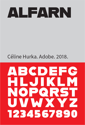
Alfarn
Inspiration
Hidden Treasures of the Bauhaus: fonts.adobe.com/fonts/hidden-treasures
Bauhaus is the name of one of the greatest bands of the 1980s. Strangely enough, it’s also the name of an art school in Germany that set out to combine crafts and fine art, and to make modernism part of everyday life. One of their most popular slogans was “Form follows function, the way hangovers follow alcohol.” Later, in the interest of brevity, it was shortened to simply “Form follows function.” These folks were serious about keeping it simple.
The Bauhaus was set up in Weimar in 1919, moved to Dessau in 1925, and then moved to Berlin in 1932, where it operated until the Nazis — realizing that all good design is potentially subversive — had them shut down. The school was founded on the principle of an interdisciplinary approach to art education. Courses at the Bauhaus blended theory and practice, with the purpose of unifying art, craft, and technology. During its brief lifetime, many of Europe’s leading artists and designers were on its faculty: Anni Albers, Josef Albers, Herbert Bayer, Max Bill, Marcel Breuer, Johannes Itten, Wassily Kandinsky, Paul Klee, Laszlo Moholy-Nagy, Piet Mondrian, to name a few, as well as its three directors, Walter Gropius, Hannes Meyer, and Ludwig Mies van der Rohe.
After the school was closed, the staff emigrated, many of them to the United States. In 1937, Laszlo Moholy-Nagy founded the new Bauhaus in Chicago. This would subsequently become part of the Illinois Institute of Technology. After World War II, the Bauhaus style became one of the most influential currents in modern design, and it continues to have a profound influence upon architecture, graphic design, interior design, industrial design, and typography.
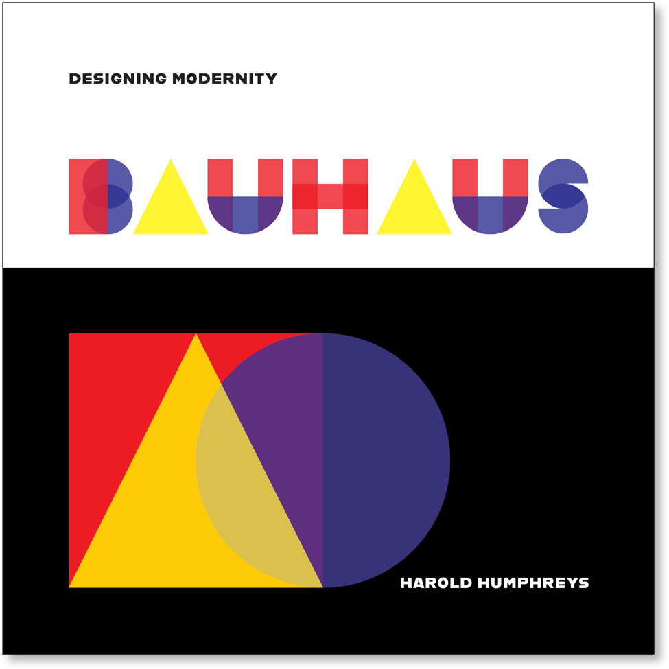
Wassily Kandinsky, one of the school’s founders, assigned the colors red, blue, and yellow to the square, circle, and triangle, respectively. The theoretical study of these colors and shapes was a major part of the school’s famous preliminary course. Taking this as inspiration, the main part of this project is to construct letterforms based upon the square, circle, and triangle in the primary colors of red, blue, and yellow.
Creating the letters
Begin with the three basic shapes, all at the same size. Reduce their opacity to 80%, so that when overlapped, they will create additional shapes.

Basic shapes and primary colors: the building blocks of our letters
Drag down copies of these shapes to make each of the letters. Draw down guides to mark the top and bottom of the shapes. Make sure Smart Guides are turned on so that the different parts align exactly. To aid precision, work at a large view size, and toggle back and forth as necessary to the Outline view. Take full advantage of the use of the Align buttons in the Control or Properties panel, and reduce the size of the keyboard nudge increment in the General Preferences. Adjust the stacking order of the objects as necessary to create the most effective overlap from the transparency settings.
The most difficult letter is the S, which requires the use of the Shape Builder tool. Scale the circle to 66%, duplicate it, and then draw a line with no stroke color from the top anchor point of the lower circle and another from the bottom anchor point of the upper circle beyond the outside of the circle. With the Shape Builder tool, hold down Option/Alt, and click to subtract the segment that this creates.

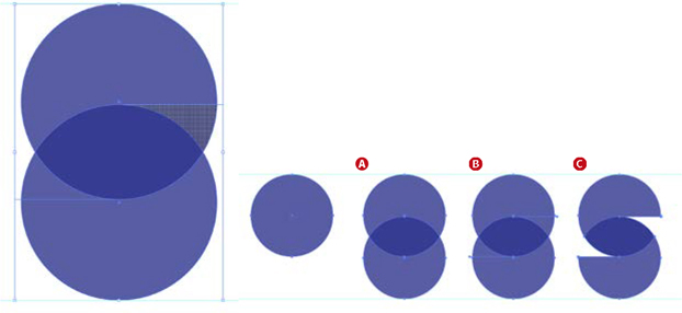
Draw a circle; then drag down a duplicate, overlapping the original, with the top anchor point of the copy overlapping the center point of the original (A). Draw a line from the center points of the circle to the right edge of the top circle and the left edge of the bottom circle (B). Use the Shape Builder (holding Option/Alt) to subtract the unwanted segments (C).
The letter U begins as the red square sized to one-third of its width, duplicated and then overlapped with the circle. Cut the circle in half with the Scissors tool, and delete the top portion. Using the Shape Builder tool, delete the unnecessary segments.

Poster by Joost Schmidt for the Bauhausaustellung (exhibition), 1923

Constructing the U:
Resize the red square to one-third its width, duplicate it, and overlap with the blue circle (A).

Use the Scissors tool to cut the circle at its left and right anchor points; delete the top portion (B).

Use the Shape Builder tool (holding Option/Alt) to delete the unwanted segments (C).
Making sure that the different segments of each letter are grouped together, arrange the letters in order, and space them using the Horizontal Distribute Space option on the Align panel.
This will be a step in the right direction, but you will need to adjust the space by eye — the equivalent of manual kerning. When you’re happy with the spacing, group all the letters together, and then scale and position them on the artboard.
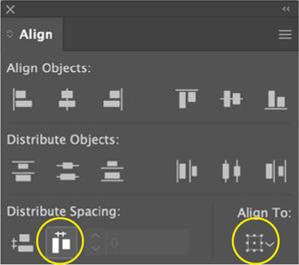
Start by evenly distributing the spacing between the letters; then adjust manually by eye.
Create the cover
We chose a square format for the book to accommodate both horizontal and vertical images. To aid us in the placement of elements, we needed a layout grid. Although there is no obvious Create Grid dialog in Illustrator, it’s easy enough to create one: Draw a square the same size as the page, and then split it into a grid (Object > Path > Split into Grid). We chose 10 rows and 10 columns with a 12-point gutter space, and then converted the resulting squares into guides (View > Guides > Make Guides or Cmd/Ctrl+5).
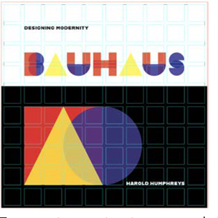
The cover designed on a 10 × 10 grid
To support our custom type we needed a more conventional font, but also one that’s “on message.” We chose Alfarn, one of the typefaces that makes up the Hidden Treasures of the Bauhaus collection available on Adobe Fonts. It is based on capital letters designed by Bauhaus student Alfred Arndt (1898–1976). We let the placement of the subtitle and author name be suggested by the grid fields.
On a background of rich black (C50 M50 Y50 K100) that occupies the bottom three-fifths (we felt a 50-50 split would look too static) of the cover, we repeated the motif of the basic shapes — overlapping and combining them with transparency.

The Bauhaus building in Dessau, designed by Walter Gropius and completed in 1925 PHOTO: SPYROSDRAKOPOULOS