
Poetry
Be flexible and sweat the small stuff
The Brief
Design a book of poetry with special consideration for the conventions of typesetting verse
Trim Size
6 × 9 inches (152 × 229mm)
Learning Points
Centering text on the longest line
Harnessing OpenType features like discretionary ligatures
Managing text flow
Tools
InDesign
Fonts Used
Mrs Eaves
Inspiration & Resources
Project Gutenberg is repository for thousands of public domain texts: gutenberg.org.
Typography is often put to many frivolous, uninteresting, and uninspiring uses — advertisements, propaganda, unfunny jokes. But can anyone think of a more important, more sacred, more essential use for typography than to provide a voice for a poem? To set the stage for beautiful words that inspire contemplation and reverie? We can’t come up with anything.
The key words here are simplicity and tradition. We want the design to be spare and clean, to let the words take center stage. And we want that classic look of traditional book design to lend some gravitas to the moment.
The layout of poetry pages presents many of the same challenges as prose when it comes to text flow, but there are certain unique considerations.
Page size and margins
For portrait-orientation books, a 2:3 aspect ratio works well. We want to frame the text with white space and let the words breathe on the page, so the margins should be generous. Just how generous will depend on your personal taste, the length of the poems, and the page count of the book. For our example, Songs of Experience by William Blake, we’ve chosen margins in these proportions: 1:1.5:2:2.25. That’s starting with the inner margin and on a verso moving counterclockwise.


Take into account the binding: If the book is side sewn or perfect bound, the inner margin should be larger. The top margin can be larger if there are running heads, which also help stabilize the page. Headers or folios at the bottom can help anchor the layout. These elements should be the same size or 1–2 points smaller than the text itself.

William Blake poems must not be displayed in just any old typeface. Choose an inappropriate font and the ghost of the great poet might come for us in the night. We hope he would approve of a modern classic, Mrs Eaves.
Type choice and formatting
Readability is, of course, important. Our job is to encourage the reader to focus on the poem. While we certainly don’t want to do anything that upstages the words, in the context of poetry, readability can, we think, be interpreted more liberally. Because speed and ease of reading are not the paramount concerns when setting poetry, you can opt for a typeface with more personality. In fact, you want to slow the reader down — just a bit. They are meant to contemplate the language, the turns of phrase, the choice of words.
The type size should be the same as fiction — somewhere between 9 and 12 point — or perhaps a point or two bigger, depending on the characteristics of the font and the length of the lines. You can be more generous with the leading — you’re not trying to pack in information, but rather make the type comfortably inhabit the page. Where prose calls for between +1 to +3 points of leading, poetry can be leaded by +4, or even as much as +6 points. There are no hard and fast rules.
We’ve chosen Mrs Eaves, a traditional serif with a twist. Designed by Zuzana Licko, it is a revival of Baskerville (designed in the 1750s) and named after Sarah Eaves, typesetter, printer, housekeeper, and ultimately wife of John Baskerville, and one of the forgotten women of typographic history. We like to think that William Blake (whose poems these are) would have approved of this choice, being a fellow printmaker and near-contemporary of Eaves and Baskerville. As well as being a beautiful typeface, Mrs Eaves has an extensive range of discretionary ligatures that gave us the chance to add flair and distinctiveness.
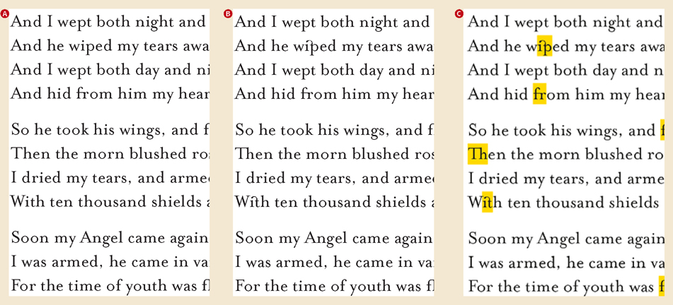
Without discretionary ligatures (A)
With discretionary ligatures turned on (B)
Discretionary ligatures highlighted by the Composition preference Show Substituted Glyphs (C)
You can adopt an opt-in or opt-out strategy here depending on how many ligatures you want to use. To turn them all on, incorporate them into the paragraph style option. In OpenType Features, check Discretionary Ligatures and Contextual Alternates. Whenever you want to turn off a specific instance, use the Type Contextual Controls — select the ligature and switch it for the non-joined character combination, which will appear in the row of alternates beneath. Alternatively, if you just want the occasional discretionary ligature (the operative word here is discretionary), add them on a case-by-case basis using the Type Context Controls or the Glyphs panel.
Mrs Eaves is part of a large extended family of typefaces, and one of its members is Roman All Small Caps. Their wider aspect ratio yields a stronger presence than regular caps, which we felt worked well for the poem titles.

Kerning the space around the apostrophe; Before (A) and After (B)
Create a character style that applies reduced tracking (C) (the exact amount will vary in different situations).
Incorporate this into the paragraph style as a GREP style. In this case, the GREP expression is .’. [Any Character Apostrophe Any Character] (D).

Mrs Eaves OT Regular 20 pt vs. Mrs Eaves Roman All Small Caps 22 pt
As much as you admire a typeface, there may be small things that you don’t like. In this case, it was the space around the apostrophes (something Hugh is very sensitive to because of the apostrophe in his last name). Thankfully we didn’t need to kern each instance individually, but instead added a GREP style to the body paragraph style. This found every instance of an apostrophe and reduced the kerning between it and the character that preceded it and between it and the character that followed. (We know that technically this is tracking because it is applied to a range of characters rather than between a pair of characters, but we’re thinking of it as applying two kerning pairs at the same time.) Obviously this is a very specific example, but this approach can be adapted to address any “problems” you may have with a typeface that threaten to spoil an otherwise beautiful relationship.

Using Discretionary Ligatures in Mrs Eaves
Incorporate them into a paragraph style (A).
Insert them on a case-by-case basis through the Glyphs panel, where you can filter your view to see specific subsets of the font (B).
Use the Type Contextual Controls (C) (Preferences > Advanced Type).
To highlight where the alternates and ligatures have been applied, select Substituted Glyphs in the Composition preferences (D).
Centering the text on the longest line
Visually, the poems should be balanced, and key to this is centering the text block on the longest line. (Note that if there is one eccentrically long line, you should ignore it and center the poem on the next longest line.) Centering on the longest line causes the left margin to move in and out, but it’s necessary for an optical balance.
There are (at least) two ways to do this…
Method 1: Set the text to left alignment. Identify the longest line, and center this. With your cursor at the beginning of the line, note the Horizontal Cursor Position (for some reason, InDesign doesn’t let you copy and paste this value). Apply this value as the left indent to all other lines. The downside of this approach is that you will need to repeat the process for each poem, because the length of the longest line will vary from one poem to the next.
Method 2: On the master pages, draw a vertical guide that marks the center of the type area. On the document pages, narrow the width of each text frame, so that it is only as wide as the longest line. Center the text frame on the vertical guide. The downside of this approach is that the width of the text frames will vary from one page to the next, which may induce panic among designers with more compulsive temperaments.
Either approach will work; neither is perfect.

Center the longest line (A).
Insert your cursor at the start of the line to measure its position with the Horizontal Cursor Position (B).
Align the other lines left, and add a left indent equal to the horizontal cursor position of the longest line (C).
If a poem runs on to a new page, you should indicate the continuation, perhaps with an ellipsis in the lower-right margin. Position the first overset line at the height of the title rather than where the body text normally starts. Poets hate when stanzas are split over pages, so split stanzas are usually moved onto the next page, but it will depend on how many lines are knocked over and how it looks with the rest of the text. It might be tempting to use a Keep Lines Together Keep Option for this, but to do the text justice, you should bring your discretion to each instance.
Careful: If you set the type properly on a good poem, you may trigger an emotional reaction, such as a laughter, tears, a wry smile, or the realization that life is very short. Take all necessary precautions!