
Beer Label
Craft your favorite brew
The Brief
Design a label, front and back, for a craft beer brand
Trim Size
4 × 3.5 inches (102 × 89 mm)
Learning Points
Choosing type and color
Working with layered 3D fonts
Creating a 3D mockup in Dimension
Fonts Used
Prater Sans, Prater Script
Tools
Illustrator, Dimension
Inspiration
The last two decades have seen a proliferation of micro breweries and the increasing popularity of craft beers. While we’re interested in the flavor nuances of these brews, what really floats our boat is the venerable tradition of beer label design. For our fictitious brew, we chose the name The Cat’s Whiskers because we like funny colloquialisms that signify something appealing, because we are cat people, and because we felt we couldn’t get away with the canine equivalent, “The Dog’s Bollocks.” And also because we felt the world didn’t need another beer label with the common motifs of hops, barley, barrels, or tankards.
It’s no surprise that the vintage style is ever popular when it comes to beer labels, but in recent years more light-hearted, brightly colored labels are increasingly trendy. We’re aware that cans have become popular for premium beers, but our label is for a traditional longneck bottle.
Create the illustration
Our starting point for this project was not the type nor the color, but rather the simple cat’s whiskers illustration. We started with a rounded triangle, but after studying actual cat noses, realized just how complicated that form can be. Enter the Eraser tool: We subtracted part of the shape and then reflected it so that the nose was symmetrical.
Choose the type
For typeface inspiration, we decide to check out the font packs that are curated by well-known designers on Adobe Fonts. Even though you may choose not to activate all of the suggested fonts, we find that browsing the font packs can be a good way to kick-start the typeface selection process.

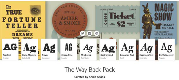
We were looking for a solid slab serif, and rather than gravitate to our fallback Clarendon, we wanted to expand our horizons. In the Way Back Font Pack curated by the fabulous Annie Atkins, we were introduced to Trevor (which incidentally is a great name for cat). But we also wanted to try out the name in a vintage condensed sans serif, a script, and — just to amuse ourselves — a blackletter font.


Trevor Black

Cheap Pine

Metalista

Spumante
The casing is driven by the font style. For example, the sans serif just doesn’t look right in upper- and lowercase, and the script looks daft in uppercase. The same is also true of the letter spacing and the leading. Some styles are going to need to be tighter or looser than others, so make sure you give each style a fair chance by choosing the formatting attributes that show it in its best light. And be sure to use Auto kerning with a script face; otherwise, the letters won’t connect in the way they are intended.
Then there are those unforeseen issues of certain negative or inappropriate connotations that arise with the combination of words and type style. For example, the slab serif treatment reminded Nigel of a popular brand of cat food. Not really the vibe we’re trying to create with a craft beer. The blackletter treatment might be a fun commentary on the sinister side of feline nature, but we’re not sure everyone would get the joke. The script font came with a range of alternate characters that gave us the chance to introduce decorative tails and curls.
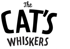
Ultimately we went with none of the above, but rather with a cheerful sans serif, Prater. So what’s in a name? Nothing really. And everything, maybe. The name appealed to Nigel who got all misty-eyed nostalgic about his visits to Prater Park in Vienna, and this in turn got him riffing about the Ferris wheel scene in the The Third Man. And it reminded him of the wonderful typography he’d photographed on the bridges of Vienna and the beers he’d enjoyed reclining in a deckchair in The Strand beer garden. So what’s this got to do with a beer label? Nothing except that type — its style, its treatment, even its name — can have strong associations. While there’s no way you can predict what all those associations might be for others, it helps to start out with associations that are positive for you. When we looked up the font, we found that it had actually been named for a beer garden, not in Vienna, but in Berlin. We’ll take that — especially since we had a shared memory of visiting Berlin together, back in the day. Imagine our excitement when we discovered that there was also a fill and a block version of the font that can be combined for a color 3D effect! Rather than creating an extruded shadow with the Transform effect through the Appearance panel (as we have done for several projects in this book), we could layer two fonts (PraterBlockFill and PraterBlockBackground) on top of each other. Is this a better way of doing it? Not necessarily, but it is different. And variety is . . . .

Prater Sans, all one size

Change the relative size of the words. Use Prater Script for The.

Apply a Warp (Arc 13%).
Mix up the baselines and adjust the kerning with the Touch Type tool. Reduce the size of the apostrophe.
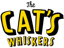
Create the 3D effect by layering PraterBlockBackground and PraterBlockFill. Change the color.

Using a chromatic font: Using Edit > Paste in Front the fill version of the font is positioned exactly on top of the background version.
Then there was the issue of what to do with the article. Do we give The equal billing with the other words or make it diminutive? We went with the latter option, in Prater Script — what the type designers refer to as “a cheeky little connected script” — and reprised this with the slogan on the back label. With the sibling font Prater Serif used for the text on the rear label, it was a real family affair.
The apostrophe was too prominent, so we reduced its size and adjusted its vertical position with baseline shift.
To liven up the type, we added a warp and turned to our old friend the Touch Type tool to make the baselines uneven.
Color palette
Our next important design decision, one that may be made concurrently with choosing the illustration and the type, is of course the color. The psychology of color is fascinating but can also be quite intimidating. Are you going to set off an international incident if you choose the “wrong color” and send all the wrong messages? You’ve probably seen a list like this before:
Red: Passionate, bold, playful
Orange: Energetic, invigorating, enthusiastic
Yellow: Joyful, optimistic, highly visible
Green: Natural, environmental
Blue: Trustworthy, serious, confident
Purple: Creative, successful, wise
Pink: Youthful, loving, feminine
Brown: Reliable, rugged, masculine
White: Clean, pure, innocent
Gray: Mature, accessible, versatile
Black: Authoritative, luxurious, elegant
Automatic Kerning Methods
InDesign and Photoshop have two automatic kerning methods, Metrics and Optical. The first uses the metrics in the font, the second adjusts the kerning based on the shape of the glyphs. Illustrator has the same options, but just to confuse us uses different nomenclature: In Illustrator, Auto is equivalent to Metrics. There’s also an option “Metrics — Roman Only,” which is for Japanese typography. That’s obvious, right‽
We think it’s worth taking these associations into consideration, but we also think that it’s too simplistic and limiting to follow them unquestioningly. Given the name of our beer and our type choices we’re more likely to be described as a fun, summer beer rather than a heritage brand. This leads us more in the direction of bright colors than in the direction of blacks and metallics. You’ll also want to consider the color of the bottle you’ll be using.
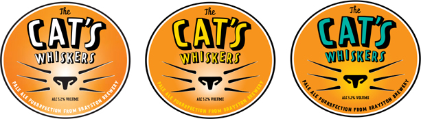
Experimenting with color options, each version on a separate Illustrator artboard.
We made several copies of our artboard (along with the art) to experiment with different color options. We tried using Recolor Artwork, but in the end found it easier just to select and apply colors on a case-by-case basis. We started out with a fairly obvious beery orange, but ultimately chose yellow type with the verdigris (sounds a lot fancier than blue-green) background because we felt it was more distinctive.
We filled the background circle with a radial gradient and set its center point on the cat’s nose to draw the viewer’s eye to this element.
For the rear label, so we could borrow elements of the front label, we made a second artboard in the same document. We invented a fictional town for our brewery, wrote a little scene to give the beer some context, came up with a snappy tagline, and adapted all the necessary ingredients text from beers that were in the fridge. To relate this to the front label, we stuck to the same colors and type choices.

You can use Adobe Dimension, part of Creative Cloud, to mock up your label onto a bottle and set it in a scene. While 3D programs are never as easy as they claim to be, we were able to put together this mockup without too much swearing.