
Travel Guide
Keeping it simple
The Brief
Create a minimalist travel guide cover that relies for its impact on type and color
Trim Size
4.25 × 6.25 inches (108 × 160 mm)
Learning Points
Using minimalism and understatement
Positioning and aligning elements
Tools
InDesign
Fonts Used
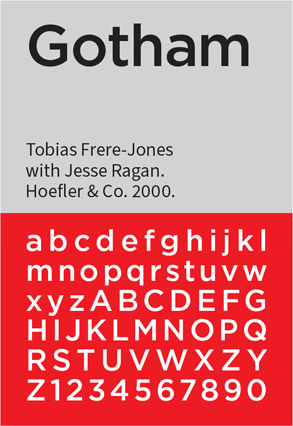
Gotham Bold (Hoefler&Co typography.com)
Inspiration
If you’re like us, you wait to pick up your travel guide until you’re at the airport bookshop. Look up and down the aisle: The books are almost always blue, with a full bleed image, and a bold, sans serif font. Hugh spent most of the 1990s designing covers for Lonely Planet, and they looked like this back then as well.
Happily, there’s a new trend in travel guide design towards understatement, with simple type and a single, flat color. Photos are used more sparingly, offering just a tantalizing glimpse of the destination. Sometimes they are not used at all. Too much white space? Blame the Swiss.
For us, this project proved a valuable lesson — one we keep learning over and over — in keeping it simple. When it comes to the number of elements in our designs, we tell our students, “If it’s not adding something, then it must be taking something away.” Advice is sometimes easier to give than to follow.
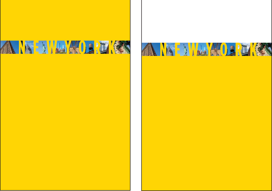
Originally, we planned to use a condensed or even compressed typeface so we could make the type block tall, like skyscrapers perhaps; the type would be widely spaced, and there would be pictures showing through the gaps. We tried it and . . . it didn’t work. The pictures were just too small. What was the point of having them if you couldn’t tell what they were? But sometimes it’s hard to let go of ideas to which you have become attached. So we tried it again with pictures that were a bit bigger and simpler, so easier to read from a distance. We adjusted the cropping this way and that. It still didn’t work. Reluctantly, we ditched the pictures, made the type black and bold, and felt we were on to something. The simplicity, the stark contrast, the type sitting atop a yellow wall. We got to where we wanted to go by taking stuff away, and with every element we removed, the composition got a little better. The end result looks like it took about ten minutes to design. And if we had known at the outset that this was our destination, that’s about how long it would have taken, but sometimes you have to go around the houses to get to where you’re going.
Color palette
As everyone knows, New York City taxis are yellow — and have been since 1967 when the city ordered that they be painted that color to cut-down on unofficial drivers. The yellow taxi is an icon of the city: instantly recognizable and infinitely reproduced. The specific yellow is called Dupont M6284, which breaks down to C0, M15, Y100, K0 in CMYK. Perhaps more than any other color, this yellow defines New York City. There could be no other choice of color for our travel guide. Initially we thought we’d have the whole cover in yellow. But that made our eyes hurt, so we decided to start the yellow lower on the page. How much lower? To figure that out we used our grid.

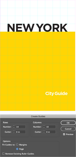
Document setup
Even with (or perhaps especially with) a design as minimal as this we needed a grid. The grid gave us focus. If you’re staring at a sea of white space (or yellow space for that matter), it can be hard to know where to begin, where to put stuff. We wanted the placement of elements to be informed by the page proportions. Because the page size is in a roughly 5:7 aspect ratio, we started by creating a 5 × 7 grid. Then, because we wanted more grid fields, we doubled the numbers to 10 × 14. We set the margins of the page to zero and used the outer grid square as the margin. Now, with a framework we could position the elements with confidence. The field of yellow dropped down four rows, providing some much needed breathing space at the top of the page, giving the yellow some context, and providing a platform for the type to stand upon. The type was sized to the height of one row, with one column of white space either side; the smaller type was aligned to the right edge of the title, its baseline sitting two rows up from the bottom of the page and occupying three column widths. Everything, to paraphrase Radiohead, felt like it was in its right place.
Type treatment and font choice
How do you convey a city as iconic and diverse as New York in type? There are a million different right answers (and probably as many wrong ones). We went down the fairly obvious path of choosing a geometric sans serif, Gotham. We love Gotham for its no-nonsense assertiveness, but its most important credentials in this context were its connections with New York City. Gotham was commissioned by New York–based men’s magazine GQ, for their masthead, and designed by Tobias Frere-Jones in 2000. It was inspired by the architectural lettering that Frere-Jones photographed in his walks around the city, and especially by the lettering on the Port Authority Bus Terminal, which has been there since 1950. Could it get any more New York? Well, yes: In 2004 Gotham was used on the cornerstone of the Freedom Tower at the World Trade Center site.
We set the automatic kerning to Optical, which spaces the letters according to their shapes rather than the font metrics. Generally, this is our preference when working with display type, and it usually results in tighter space. And the reason we’re saying usually is that it will vary from font to font, depending on the kerning metrics that are in the font in the first place. In fact with Gotham, it didn’t make much difference. Note that we tightly kerned the space between New and York so that it’s only just there. We thought this made the type look more solid, and anyway no one is going to read it as a single word.
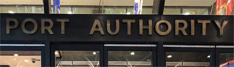
The signage on New York’s Port Authority Bus Terminal — the inspiration for Gotham
Rip It Up and Start Again
Originally, we wanted pictures between the letters. In the first iteration the yellow covered the whole page, but it turns out you can have too much of a good thing.
We adjusted the top of the background rectangle to the baseline of the type. This provided some much needed air at the top of the page and made the book feel taller. A step in the right direction, but the pictures weren’t working and had to go.
Next, we adjusted the kerning of the letter pairs to make the space between the letters look as even as possible. A trick for doing this is to rotate the spread — this makes the type more abstract and lets you concentrate on the negative space. With the kerning preference set to the smallest increment possible (1), we used the keyboard shortcuts Option/Alt+Left Arrow to kern tighter and Option/Alt+Right Arrow to kern looser.

Set the kerning increment to 1 so that you can kern using keyboard shortcuts (Option/Alt+Left Arrow and Option/Alt+Right Arrow) with more precision. Optionally, choose View > Rotate Spread > 180° to turn the page upside down to help you better concentrate on the negative space between the letters.
We kept a copy of the type, just in case. After we were done futzing around with the kerning, we compared our result to the original — and decided we’d made it worse! Another valuable design lesson perhaps: If ain’t broke, don’t fix it. But — and this is what we tell ourselves when we’ve spent hours getting nowhere — without trying these other options, we couldn’t appreciate how much we loved it just the way it was. “Don’t go changin’, trying to please me . . . ”

A Lonely Planet cover that Hugh designed in 1997