
More Classic Fiction
A chat about illustrating a classic
The Brief
Illustrate a book cover for a classic work of fiction.
Trim Size
6 × 9 inches (152 × 229mm)
Learning Points
Working with hand-drawn type and artwork
Creating separations with the Layers panel
Locking transparency in Photoshop
Tools
Photoshop, pen & ink
Inspiration
To Kill a Mockingbird is a classic of American fiction. For the 50th anniversary of this title in 2010, Hugh was commissioned for a leather-bound edition by Sterling Press. In contrast to Nigel’s treatment for 1984, which is appropriately mechanical and digital from start to finish, Hugh chose a handmade approach for this memoir of childhood because he wanted the type to feel intimate, almost as if a child — maybe the main character, young Scout — had drawn it herself. To help explore this topic, Nigel asked Hugh a few questions in interview format:
Nigel: So, this is one of your favorite projects. How did it come about?
Hugh: Sterling Press — the publishing arm of Barnes & Nobel — was planning on doing a commemorative edition of To Kill a Mockingbird for the 50th anniversary in 2010. They liked my silhouette illustrations and wrote to ask me if I knew the book.
N: Did you?
H: This is one of my favorite books! I loved it as a kid, and now as an adult I like it even more. That actually made it hard to do — more pressure.
N: How did you approach the typography?
H: I do a lot of book covers for young adult novels, and I always ask if I can do the type treatment myself. I often hand draw the type, as I did in this case. This saves me from living with some other designer’s type over my image (what a nightmare!)
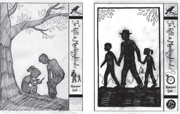
Hugh did multiple sketches, refining as he went, before going to ink. Here are two of the pencil sketches for the back cover.
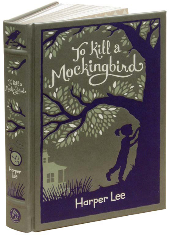
The 2010 edition from Sterling Press/Barnes and Noble is printed in three colors on leather. This meant making sure the file had the separations set up correctly.
I also really love script lettering that isn’t slanted — where the ascenders and descenders are vertical. I’m not sure if that style has a name, but to me it’s more elegant and interesting. I also love it when letters have flourishes that end in little circles (see “Add Flourishes” in “Type as Image”), so I included that element. Then, for the author’s name, I went for a child-like lettering — I let it be more awkward. I actually expected the publisher to reject this element, but they liked it!
N: So the type was drawn by hand, not drawn in Illustrator?
H: Yes, the whole cover was drawn by hand, ink on paper, and then scanned and opened in Photoshop. As great as digital tools are, there’s just something about traditional materials that I find inspiring. I love the unpredictable nature of ink on paper, the way it feels to use a brush and pen together, and I love the ability to see the entire page at once — whereas on screen, I feel I’m constantly scrolling up and down, zooming in and out.
And by bringing my ink work into Photoshop, of course, I get the best of both worlds!
N: This was printed with three spot colors on leather. Do you have any tricks for creating separations?
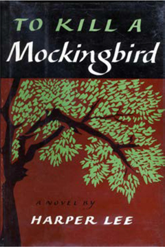
Hugh was inspired by the original, first edition cover design by Shirley Smith — including the evocative way the leaves are drawn.
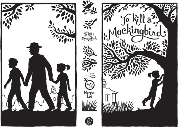
Hugh started with simple black-and-white line art. Anything that will have a color either is a solid black shape or has a black outline. Using Levels and Curves adjustments, he pushed all the values to either black or white (with the exception of a few edge pixels, which provide some anti-aliasing to smooth the edges).
H: Yes. My way of working is to start with an ink drawing in which all the shapes are black or white. I scan it, convert it to grayscale, and then use Levels and/or Curves to make it pure black and pure white — no gray. (Of course, there is some cleanup — removal of tiny pixels and smudges.)
Then I turn the color mode back to RGB, go to the Channels panel, and select one of the channels (it doesn’t matter, since each channel is the same). I load a channel, using the Load Channel button at the bottom of the palette.
That gives me marching ants around the artwork. At this point, everything white is selected. I want the opposite, so I inverse the selection. Then, returning to the Layers panel, I press Cmd+Shift+J/Ctrl+Shift+J to cut the black shapes to a new layer.
The background I then fill with a new color, in this case an olive green, to approximate the leather we printed on.
Selecting the artwork layer, I click the Lock Transparency button at the top of the panel so that transparent pixels can’t be changed. Next, I go around filling shapes with different colors. For this project, I started with the leaves, trying different options for leaves to get the balance I wanted.
I then draw a lasso around the title and press Cmd+Shift+J/Ctrl+Shift+J once again, placing the type on a new layer. I again make sure the transparent pixels are locked, so I can try different color options, using Option+Delete/Alt+Backspace (fill with foreground). I find this is a great way to try different color options. You never know — the title might look better dark, but in this case it was best in the brightest hue.
In the end, I have a Photoshop file with only four layers: One is the background, standing in for the leather print surface, to be discarded by the printer. The other three layers are for the three spot colors: a deep purple, a medium green value, and an off-white.
N: Did the client have any feedback?
H: Yes! I got feedback from Harper Lee herself! She noted that I had drawn pussy willows in the foreground and pointed out that they don’t have that type of plant in Monroeville, where the book takes place, so we changed it to long grass. She made a few other very perceptive comments.

Each color is on its own layer, so the printer really doesn’t need to do any separations. They can lock the transparency (A) and fill each layer with black in order to produce the plates.

Books are three-dimensional objects. It’s important to consider how the front, back, and spine will appear to the reader as they hold the book. Each side should be distinctive and recognizable.
N: Then you set up the rest of the cover?
H: Yes, I was given specifications by the publisher for the exact height and width of the covers (front and back) and the spine. I built those carefully in Photoshop, using rulers and guides, and placed everything so that it lined up. I also designed the endpapers for the book, which was a lot of fun.
N: I love the endpapers — tell us more.
H: The endpapers combined a few elements from the spine: the small bird at the top and the small coin at the bottom. I suppose I could have, and probably should have, used the pattern tools in Illustrator. But as an old-school fellow, who was using Illustrator long before it had such fancy features, I built these myself.
I started with two diamonds, each with an image carefully placed inside of it. With Smart Guides on, I dragged off a copy (Option/Alt-drag) and made sure its corners aligned with the original. Then I pressed Cmd/Ctrl+D (Transform Again) several times to create a long line of about 10 copies. I selected all (Cmd/Ctrl+A), dragged off a copy with precise alignment, and repeated this action until I had a full page.
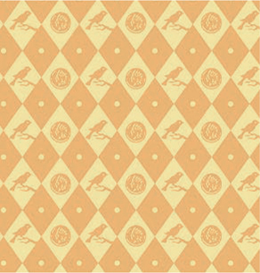
Endpapers are one of the ways to make a book feel like a genuine classic. It’s common for these pages to feature a pattern, and if it relates in some way to the text, all the better.
