
Art Nouveau
Tangled up in vines
The Brief
Create an Art Nouveau–inspired typographic poster
Trim Size
10 × 16 inches (254 × 406 mm)
Learning Points
Adding multiple strokes
Working with opacity masks in Illustrator
Using the Live Paint Bucket in Illustrator
Tools
Illustrator
Fonts Used
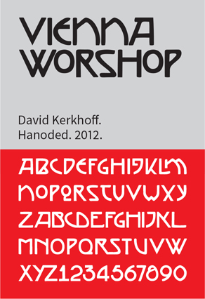
Vienna Workshop, P22 Art Nouveau Extras
Inspiration
There are a few people in the world who hate Art Nouveau. The same people also hate flowers and puppies. Everyone else loves this beautiful style that flourished (literally) between 1890 and 1910. Its characteristics varied from country to country, but all of its varieties shared a use of curved lines and natural forms, particularly flowers and plants, presented in a clean, stylized fashion. While the style embraces the natural world, it is paradoxically the result of new industrial mass production techniques.
This project starts with the slogan “For Every Time Its Art, For Art Its Freedom,” a translation from the German of the inscription above the entrance of the Secession Building in Vienna. (The Vienna Secession was a group of radical Austrian artists, including Gustav Klimt, Koloman Moser, and Joseph Hoffman who, in 1897, broke away from the artistic mainstream. Think of them as the punks of their time.)
Setting the type
Start by centering the type on the artboard. Reduce the leading (we changed the Auto Leading value from 120 to 100%), and insert line breaks to break the phrase sympathetically. We typically find that Optical automatic kerning is tighter than Metrics, making it preferable for display type, and that was the case here. Because we wanted to add strokes around the letters, we increased the tracking to give ourselves some growing room. We reduced the word spacing in the Justification settings on the Paragraph panel to 50% for Minimum, Desired, and Maximum. We added optical margin alignment (Type > Story), which factors in the punctuation at the ends of the lines. Finally for this step, we changed the ER letter combination to a ligature, through the Glyphs panel.

The standard ligatures that are part of the Vienna Workshop font
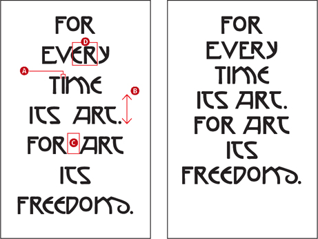
Finessing the type: The automatic kerning method is set to Optical (A), the leading is reduced (B), the word spacing reduced (C), and a ligature applied (D).

Adding multiple strokes to the type
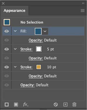
The best way to add multiple strokes is through the Appearance panel. Start by adding a new fill for the dark blue. Then, add a stroke, make it gold, increase its weight, and move it beneath the fill. Add another stroke and make its weight half that of the previous stroke.

Using the Appearance panel, a color fill sits above two strokes. The bottom (gold) stroke is heavier than the stroke above, creating the offset stroke effect.
Add the frame
The frame is constructed using the same method as the previous project: A single piece of vector art (in this case part of the P22 Art Nouveau extras font, converted to outlines) is copied, reflected, and joined together by extending the end points into a single frame. It was made into a single item using Pathfinder > Add and then converted to a Live Paint Group and colored.

The sunflowers are suggested by the decorations on the Karlsplatz metro station in Vienna.

The vector artwork, is duplicated and reflected to create the four corners of the frame.


The end points are extended to create the frame edges, at which point the separate pieces can be combined into one using Unite on the Pathfinder panel.

Use the Live Paint Bucket to convert the artwork to a Live Paint Group, at which point the segments can be colored.
Add the vines
The vector artwork for the vines comes from the P22 Art Nouveau extras font. We converted this to outlines and then scaled, flipped, and rotated as necessary to combine the vines with the type. Alternatively, you could use Illustrator’s Vine brush, which is in the Decorative > Elegant Curl & Floral Brush Set. Once the vines are in place, the challenge is how to make it appear that they are entwined with — and growing from — the type. This requires the use of an opacity mask, probably one of Illustrator’s most confusing features.
The opacity mask will be made from the type. Make a copy of the type on a new layer above the vines layer. Expand the type (Object > Expand Appearance), and change its fill and stroke to black. Now select this type and the vines, and, on the Transparency panel, choose Make Mask. The mask starts out black; deselect Clip so that the vines are masked by the type shape.
The shape of the type will now mask the vines where they were formerly overlapping the letters. To create the entwined effect, target the opacity mask (a blue frame will appear around its thumbnail), choose the Blob brush, and paint in white to restore the opacity.

To make the opacity mask: Select the copy of the type and the plants layer below, and then choose Make Mask on the Transparency panel (A). Deselect Clip (B). Target the opacity mask (C), and paint with the Blob brush in white to reveal portions of the vine. (D).
The paper texture is a stock image, placed on its own layer at the top of the layer stack, with its blending mode set to Multiply at an opacity of 80%.

The Secession Building (1898) in Vienna, Austria