
Business Card
Make a good first impression
The Brief
Design your own business card
Trim Size
3.5 × 2 inches (85 × 55 mm)
Learning Points
Implementing hierarchy and white space
Sweating the small details
Tools
Illustrator or InDesign
Inspiration & Resources
anvari.org/cols/Creative_Business_Card_Design_Ideas.html
uprinting.com/die-cut-business-cards-printing.html
moo.com/us/business-cards/finishes
In the digital age, everything seems to have changed — how we communicate, how we get news, how we consume media. But one thing hasn’t changed: If you meet someone new and wish to share your contact details, you hand them a business card — the old-fashioned way. (What’s that you say? You sometimes look people up on Facebook or LinkedIn and send them a friend request? Please, don’t do that. Just . . . don’t.)
So you still need an effective, good-looking card. But these days, you need more than your logo, company name, name, title, and phone number. How about your URL? Your email, naturally, so that people can sign you up without permission to their mailing lists. You might also want to list your Instagram and/or Twitter handle — or whatever new service is suddenly essential. Gotta stay current!
How do you manage to fit all this information onto a business card and have it still be readable and attractive? Your canvas is 3.5 × 2 inches (or 85 × 55 mm in Europe). They say creativity unfolds within a system of limits, but wow! That’s limited.
There are two approaches: the minimalist and the maximalist.
Minimalist approach
Less is more. When in doubt, leave it out. You don’t need every possible method of contact on your card any more than you need your blood group or your mother’s maiden name. Include only the essential stuff — a phone number, an email address, and a website (arguably this last could be inferred from the email, but that might be too minimal for most). The rest you can supply on a need-to-know-basis.
The rule of three applies here. As your audience views your card they will have enough cognitive space in their tiny attention span to notice only three things — and we all have tiny attention spans. One big thing; another less important thing; then something even less important.
The most important thing might be your company name and logo. Or it might be your name. You’ll want to decide now: which is more important, your title or your contact info? Because one or the other needs to take third place. (Don’t worry. Everyone gets a trophy!)
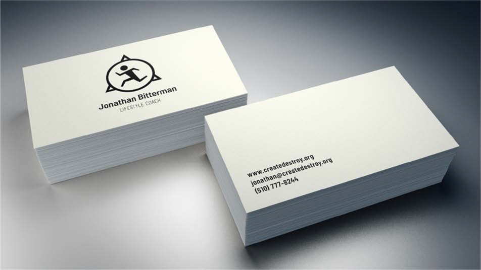
In the minimalist approach, white space is your friend. By allowing a lot of breathing room around the significant details, you let your card recipient know how important those details are. The card has two sides: How about your logo on one side, and your name, title, and info on the other? Your card recipient’s brain is happy, because you have not over-taxed it.
Or, perhaps you want to try something clever and unusual. The kind of business card that gets cited in those “Best Business Card Ever!” lists online. You’ll be challenging some people, but because your design solution is smart, your audience will happily pay an “attention tax” if it means the chance to make contact in the future. Be careful with this approach: If it goes wrong, your card will be overlooked, or remembered for the wrong reasons.
Maximalist approach
You just can’t do it. Cutting that much essential information? It’s painful. And you know that if you leave it out, you’ll always be writing it in by hand, every time you hand out a card. “Oh, just a moment — let me scrawl my Twitter handle for you in illegible script while we are in this darkened bar.” It’s an understandable concern.

Ever the contrarian, Hugh opted for a vertical card — but then rotated his email address. This is sure to confuse some people, but he hopes it will act as a filter, limiting his client base to only those clever enough to rotate a card.
Okay, well consider adding flaps. If you really have loads of information you can’t leave out, you can add a second page with a folding card — think of it as a miniature booklet. Your audience will be so intrigued upon meeting you that they will open your card with the same care and attention they bring to opening a favorite book, examining the information provided, and extracting the relevant details for their Rolodex. Either that or it will be discarded because it doesn’t fit into your recipient’s wallet.
Organizing the information
If working at such a small size seems restrictive, rather than think of your business card in terms of absolute measurements, think of its proportions. The aspect ratio of a typical business card is 1:1.17, similar to a movie screen, or a poster. When it comes to organizing the information on the page, a business card is no different from a much larger piece. With a poster, you’d be thinking about hierarchy and contrast, setting up margins, and organizing the content on a grid. What’s to stop you doing the same here?

Companies such as moo.com and uprinting.com can produce all kinds of special finishes and fancy touches that make a business card a bit flashier. They also offer a service they call Printfinity, which allows each card in your pack to be unique. If you’re a photographer, for example, you could have a different image on every business card.
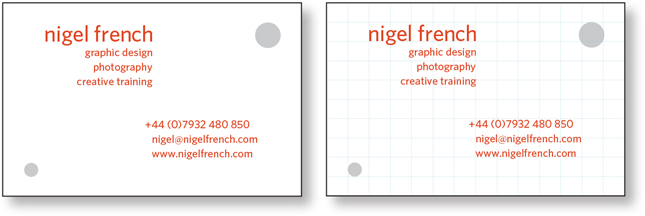
Design your business card on a grid, just as you would a book cover or poster.
But while we’re considering blocks of text in a tiny area, let’s think about what will definitely not work: two columns of information, with one block aligned left, the other aligned right. Doing this creates an awkward space in the middle of the card. You should also avoid the temptation to assign different pieces of information to the four corners of your card as if to conceal the white space. Rather than create a balanced effect, this is more likely to make the interior of the card feel like a no-go zone, and give the impression that the information is trying to escape off the page.
Don’t fear the white space. With only the essential information on your business card, people won’t be confused about how to contact you. An uncluttered business card designed with intentional white space not only makes it easier to identify the preferred contact method, it projects confidence.
With so little space to work with, what you include and what you leave off your business card is critical. For the details that make the cut you’ll want to carefully consider every character — including the spaces between them.
When it comes to phone numbers, those brackets or parentheses that go around area codes nearly always look too low if you’re using lining numbers because there are no descenders. You might want to shift their baselines up so that they surround the numbers like a warm embrace.

Or perhaps your typeface has alternate versions of the brackets, so that

But if you’re using oldstyle numerals, the position of the parentheses should be about right.

But maybe you don’t need brackets. Maybe periods instead, or hyphens. Or go super minimal and just chunk your phone number with spaces. Which of course raises the question, what size of space? Is a regular word space sufficient, or should it be an en space, or possibly even an em space? Depending on your clientele you might also want to include the international code for your country.
If your typeface has different numbering styles, which are you using: oldstyle or lining? It’s personal preference, but you’ll almost certainly want the proportionally spaced version of whichever you choose. The tabular versions are — not surprisingly — for tables. Do make sure to check the kerning on the numbers, especially the 1s, which are notorious for looking too gappy. Adjust as necessary.

The @ symbol is often too big relative to the characters either side. You might want to reduce its size by half a point.

To make your business card bespoke, consider which discretionary ligatures might be available in your chosen font. (Nigel remembers the heady rush of realizing that a client had an ffl combination in her last name so that he was able to deploy a discretionary ligature. Happy days!)

Also explore which, if any, alternate characters may be available. You can find them on the Glyphs panel.

Go Bob!
Question every element and whether you really need it. Every single bit of information, down to the last comma needs to be pulling its weight — there’s no room for freeloaders. Consider how each piece of information is formatted. Leave out redundant tags like phone: or email:. People know what a phone number and email address look like. Do you really need parentheses around a phone number area code? You certainly don’t need the http:// for the web address — but do you even need the www.?

TMI!: Cramming too much into a small space creates confusion.

Trapped: Flushing left and right traps the white space (indicated in cyan).
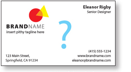
No-man’s land: Pushing information to the corners looks indecisive.
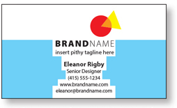
Static: Centering creates equal — static — white space on either side.
Wedge: Too much right alignment creates awkward white space. The information is harder to read because each line starts at a different point.

Considerations
When designing a business card, you’ll want to ask yourself the same question you ask when you are considering whether to take a nap: horizontal or vertical?
The horizontal card will be the classic approach. We estimate that approximately 93.2% of all business cards are oriented this way. It allows for longer lines of text, and for some people will feel more natural. Why rock the boat?
Alternatively, maybe vertical is the way to go. You don’t wish to be like everyone else, and in any case, you accidentally set up your template with the small number first, so it’s 2 × 3.5 instead of 3.5 × 2. There’s no time to change your template, and now you have a vertical card.
One of your most important considerations will be paper stock. Any decent business card printer will have multiple options. If you’re going with uncoated stock, you’ll have that warm feel of paper, the way it breathes and also happily accepts ink if you need to write on it. But if you choose coated stock, you can go for those satin and velvet finishes, so that when someone touches your card, their fingers get a little thrill. (Hopefully, it’s an unconscious thrill that translates into later business.)
Also key is the weight of the paper. Hugh’s card is printed on recycled chipboard, which he likes to imagine makes his card stand out as an example of sustainable design. Nigel’s card is letterpress printed on heavy “beer mat,” stock which he likes to think makes an immediate tactile impression. Unless you live and breathe paper stock weights, there’s no substitute for actually seeing and touching the stock. Have your printer show you or send you some samples.
Peacock that card
One way to keep your business card out of the recycling bin is to make it truly memorable with some unusual printing methods. At one time, these were so prohibitively expensive that the only people with foil stamps or die-cut cards were self-indulgent billionaires, and designers with friends in the printing business. Happily, these print finishes are becoming cheaper by the moment.
Die cuts are one method. Your card need not be perfectly rectangular: One edge can be cut away into an interesting shape — perhaps a curve or flourish borrowed from a logo. There’s negative space as well: Why not use a die to cut an interesting hole that adds meaning to your brand? Another option is to emphasize an element with a spot varnish. Generally a die cut or spot varnish needs to be a vector shape, clearly labeled on its own layer, but each printer will have their own setup requirements, so be sure to discuss your intentions with them at the outset.