
Grunge
Here we are now, entertain us
The Brief
Create a grunge-inspired typographic poster
Trim Size
Tabloid/A3
Learning Points
Using Photoshop clipping masks
Creating a custom brush in Photoshop
Slicing text
Tools
Illustrator
Fonts Used
Template Gothic, Citizen
Inspiration
The 1990s might have seemed like a confusing mishmash of stylistic trends with no coherence or overarching narrative, were it not for the clever marketing departments of corporate America. These geniuses found a great term to slap across the entire decade: grunge. If you were a young person at the time (as your authors may or may not have been), you knew exactly how to respond: “Yeah, whatever.”
Throughout history people have imitated the designs of the past. What was new in 1990s was the sudden ubiquity of home computers with professional design software. It had long been the case that for music, all you’d needed was a guitar and three chords; now we had the design equivalent. Any idiot with a computer and basic knowledge of PageMaker, QuarkXPress, or Ventura Publisher had the power to design posters, CDs, and even books and magazines. And they did. (We were the idiots, in case you were wondering.)
A cynic might say that the reason for the popularity of grunge was that you could pass off your mistakes as design intentions. You didn’t need to learn the rules. Mistakes looked cool, and sloppiness was a virtue. If a memory error on your 40 MB desktop computer over-wrote your design file with a pattern of misaligned pixels, you were a genius.
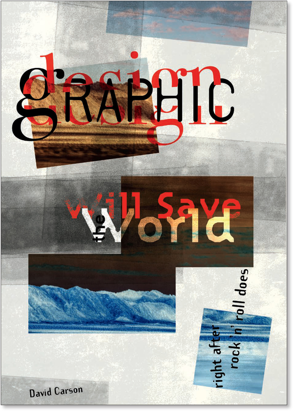
One of the true pioneers of design at that time — the Kurt Cobain of design, if you will — was David Carson, art director of the influential Ray Gun magazine from 1992–1995. Carson’s distressed, dissected, and overlapping type treatments were chaotic and hard to read, but as he pointed out, communication was about more than readability. His work was a response to the unimaginative corporate design that had become commonplace — perfectly legible, but mind-numbingly boring. Carson challenged the reader. The expressive qualities of his designs made you want to read them, and this was the crucial difference. Like all great artists, he makes it look easy. It isn’t.

Choose the type
We chose to illustrate Carson’s wry comment: “Graphic design will save the world, right after rock ’n’ roll does.” To do so, we used typefaces from Emigre Fonts, whose fonts helped define the look of the era. Rather than try to bend classic typefaces to the new medium of digital design, Emigre was the first type foundry to design original fonts made on — and for — a computer. In much the same way as photography was liberated when it stopped trying to imitate painting and be its own thing, graphic design gained a new impetus when it gave up trying to hide the characteristics of digital typography and instead to embrace them as strengths. Rudy VanderLans and Zuzana Licko of Emigre made a virtue of the shortcomings of early digital type and designed a range of typefaces that played up, rather than down, the blocky characteristics and stairstepped look of bitmap type.
Choose your weapon
We decided to use Photoshop to create our poster. And as we did so, we could hear the jaws of our InDesign and Illustrator guru friends and colleagues hitting the floor. Photoshop for type‽ Are you insane‽ we imagined them thinking. Debate rages about the best tool for creating posters: clashes between marauding gangs of InDesign, Illustrator, and Photoshop aficionados have led to bar room brawls, broken families, and severed friendships. But at the end of the day, it’s about where you’re most comfortable. And for this project, Illustrator just felt too clean, and InDesign too tight. Historically typography has always been Photoshop’s Achilles’ heel, but today Photoshop has a sophisticated typographic toolset. (That said, we sometimes wish that the InDesign, Illustrator, and Photoshop engineering teams would talk to each other a bit more, so that they could share the typographic love. You may say we are dreamers. But we’re not the only ones.)

Two copies of the image are clipped to the shape layer below.
Create the background
In the background is an evocative image, taken from the passenger seat of a moving car with intentional camera movement. There are two copies, one position below the other, the bottom version converted to a negative (Cmd/Ctrl+I). This was partly expediency — we wanted to cover a vertical page with a horizontal image — but also because it introduced another element of randomness and happy accident. So that only parts of the images were visible, on a new layer we drew a series of rectangles and rotated a couple of them. Selecting each of the image layers and pressing Cmd+Option+G/Ctrl+Alt+G, we created a clipping group, so that the images were only visible within the shape areas.
Add texture with a custom brush
A grunge design begs for some texture. So we repurposed a texture layer from a previous project, saved it as Smart Object, applied a heavy dose of Film Grain filter to it, and then reduced its opacity and experimented with blending modes, ultimately settling on the old faithful Multiply. But we wanted more. Next, we photographed some clear tape on a black background, masked all the dark pixels and used what was left to make a custom brush (with the selection active, choose Edit > Define Brush Preset). In the Brush Settings panel we changed the Shape Dynamics to introduce some size and angle jitter. We dabbed a few strokes on the canvas, then returned to the Brush Settings to change the angle to 90°, and then painted a few vertical strokes. As we were working we were thinking back to 1994 when layers, blending modes, and layer masks were first introduced in Photoshop 3.0. With this amazing new technology designers went crazy with transparency and blending effects. (To channel those heady times be sure to have at least a dozen layers titled Layer 1 copy in your finished composition.)

Spreads from Ray Gun magazine (left) and Beach Culture magazine designed by David Carson. If you weren’t studying these in the 1990s, what were you doing with your life?

To create the custom brush, isolate the tape from its background (A).
Choose Edit > Define Brush Shape.
On the Brush Settings panel, introduce some randomness with a Size Jitter and Angle Jitter.
Add the type
For graphic design we combined the timeless classic Bodoni with what was then the young pretender, Barry Deck’s Template Gothic. To create the sliced effect, we made sure design was on its own layer. With the Pen tool we drew a rough path around the bottom portion of the letters. To convert this to a vector mask, we Cmd/Ctrl-clicked the Add Mask button. We then duplicated the layer (Cmd/Ctrl+J), selected the vector mask path with the Pen tool and from the Path operations menu on the Tool Options bar, and selected Subtract Front Shape (the equivalent of inverting a layer mask). Now, with the Move tool, all we had to do was move one or other of the two type layers. We also made sure to sandwich the black Graphic layer between the two red layers of design.
For Will Save the World we chose another Emigre font, the blocky Citizen, designed by Zuzana Licko in 1986. We broke this into three separate layers so that we could move each around more easily and apply blending modes independently. With the supporting type we kept it simple, not wanting to steal attention from the two main actors.


No matter how intentionally chaotic the layout, your Layers panel should always be logically organized. We have organized the content into Layer Groups and have also used color coding (red: type, green: texture, yellow: background).
Not only will an organized Layers panel aid a hassle-free workflow, but if you have to revisit the document a week, a month, or even a decade from now, everything will make sense.