
Classic Fiction
Type that’s in your face
The Brief
Choose a classic work of fiction and redesign its cover using exclusively — or predominantly — type
Trim Size
6 × 9 inches (152 × 229 mm)
Learning Points
Being expressive with just type and color
Setting up a book cover document
Tools
InDesign
Fonts Used
OCR-A
Inspiration
Designers love constraints: Paradoxically, working within clearly defined limits can sometimes set your creativity free. Being forced to be creative with only the materials at hand is just part of the job description. This project comes with a major constraint: to convey the essence of a book using only type.
There is a style of book cover design called the Big Book Look. Such covers highlight just one cover element, usually the type. But even working with just a single design element, there are many variants. Think about whether to highlight the author’s name, the title, or both. The choice of typeface, its scale (bigger is usually better, but not always), and its arrangement on the page are key to a successful solution. Sometimes a clever but subtle twist can be employed, in much the same way as designing a logo.
Choose the type
Spend time “auditioning” type on Adobe Fonts, or from wherever else you source your fonts. Take advantage of the sample text field, and because you are telling the story with the type, consider the story of the typeface itself. Do some digging to discover its history. Who created it? When? What are its associations and connotations, if any? Sometimes this information is easy to find (if you’re working with a classic typeface, Wikipedia is often a good starting point); sometimes there’s little, or no, information. At least make sure that your choice is not historically dissonant. For example, if you’re designing a cover for an 18th-century classic, a 21st-century typeface is unlikely to be the solution. We say “unlikely” because in some circumstances it might be perfect, but that will involve a high degree of nuance and awareness of how one historical style plays off another. A good place to explore how typefaces are used is Fonts in Use (fontsinuse.com).


On Adobe Fonts, use the Filters (A) and Sample Text field (B) to develop a shortlist of fonts.
For our example, we chose OCR-A, a font designed for optical character recognition. Created to be read by machines, OCR-A is a monospaced typeface. Monospaced fonts were originally designed for typewriters, where technological limitations required each letter to be the same width. Take a look at the i to see how the horizontal crossbars add width to prevent it from looking too narrow alongside its colleagues.
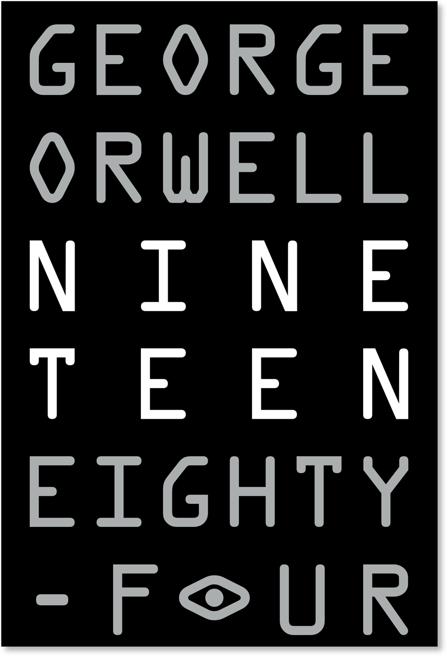
It is the machine-like, fixed-width nature of OCR-A that makes it look authoritarian and unyielding. We made the text more imposing by fully justifying the alignment, resulting in some artless gaps between the letters. (In Orwell’s dystopian nightmare, there’s no time to worry about finessing the nuances of letter spacing.) Making the text fill the whole cover adds to the sense of claustrophobia.
While most modern editions of the book set its name in numerals, 1984, some early editions chose to write out the date. We chose this route to have more raw material to work with.

Do a simple GREP Find/Change to find all characters and replace them with the found text followed by a zero- width space.
When you want text to fill a frame and to experiment with the size of the type, it can be frustrating when the text becomes either hyphenated or, if hyphenation is turned off, overset. To address this problem, use a zero-width space. As its name suggests, a zero-width space adds no spacing width, but will allow the word to break anywhere — and without hyphenation. Don’t bother looking for a zero-width space on the Insert White Space menu; it isn’t there, but you can still insert it with a GREP Find/Change using its Unicode value: U+200B. This query means find any character and replace with that same character followed by the zero-width space. Make sure to save the query in case you need to use it again.
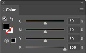
Create a rich black
Given the dark subject matter, black is an obvious choice for the background and provides the white and gray type a stark contrast. We created a custom “rich” or four-color black. Because standard CMYK black contains no cyan, magenta, or yellow, when printed, it looks more gray than black. Adding 50% each of cyan, magenta, and yellow ensures a solid result. For a more accurate onscreen preview, in Preferences, set Appearance of Black to Display All Blacks Accurately.
Mix your own custom black for any solid fill areas.
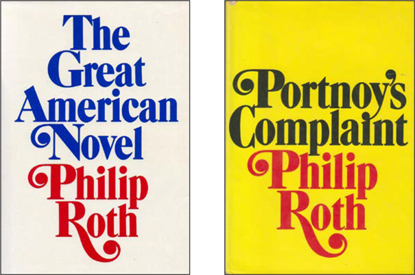
Examples of the “Big Book Look” designed by Paul Bacon
On a cautionary note, don’t use rich black for text, only for solid fill areas. Applying it to text, especially smaller text, may result in misregistration on the press. Recipes for rich black vary — according to taste (more or less cyan will cool or warm the black, while keeping the C, M, and Y the same gives a neutral result) and printing circumstances. Be sure to check with your commercial printer to see what percentages they recommend for their press.
Add a twist
Sometimes a small twist — such as a backwards, missing, or colored word or letter — may be all you need to take your design to the next level. Do a browser search for 1984 book cover designs, and you’ll see that the surveillance eye is a recurring and compelling motif. Given the eye-shape of the OCR-A Os, this seemed like an opportunity too good to pass up. Illustrator lets you select individual characters and rotate them in the context of the word, which is interesting, but we ended up taking a different approach. To keep the current letter spacing, we applied a fill of None to the existing O, making it invisible. On the pasteboard, we typed another at the same size, rotated it, converted it to outlines (Cmd+Shift+O/Ctrl+Shift+O), added an eyeball, and then moved it into place.
Prepare the spine and back cover
If you plan to take this project further and will also create the spine and back cover, ask your commercial printer to provide you a template file. This will most likely be a single landscape page that combines back cover, spine, and front cover, and is divided with guides to indicate the spine. Based upon the number of pages and your chosen paper stock, the printer will be able to provide you with the exact width of the spine.
In our experience, printers prefer that you use their template, because it’s an approach that tends to be less error prone. But if you’re feeling intrepid and want to set this up from scratch, InDesign is the best place to create a front cover and back cover spread, including the spine. Create a three-page, facing-pages document at the trim size of your book. Start out with the margins set to zero. To put the pages side by side you’ll need to deselect the confusingly named Allow Document Pages to Shuffle option on the Pages panel menu. Then, on the Pages panel, rearrange the pages as a spread. Next, use the Page tool to change the size of the middle page, which will serve as the spine. When you output the whole cover to a print-ready PDF, select the Spreads option so that you create a single spread rather than individual pages.
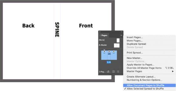
A three-page InDesign document converted to a spread. The width of the second, middle, page is narrowed to form the spine.