
22.5 Statistical Process Control
Control Charts • Central Line • Range • Upper and Lower Control Limits • Chart • R Chart • p Chart
One of the most important uses of statistics in industry is Statistical Process Control (SPC), which is used to maintain and improve product quality. Samples are tested during the production at specified intervals to determine whether the production process needs adjustment to meet quality requirements.
A particular industrial process is considered to be in control if it is stable and predictable, and sample measurements fall within upper and lower control limits. The process is out of control if it has an unpredictable amount of variation and there are sample measurements outside the control limits due to special causes.
EXAMPLE 1 Process—in control—out of control
The manufacturer of 1.5-V batteries states that the voltage of its batteries is no less than 1.45 V or greater than 1.55 V and has designed the manufacturing process to meet these specifications.
If all samples of batteries that are tested have voltages that vary within expected control limits, the production process is in control.
However, if some samples have batteries with voltages out of the proper range, the process is out of control. This would indicate some special cause for the problem, such as an improperly operating machine or an impurity getting into the process. The process would probably be halted until the cause is determined.
CONTROL CHARTS
An important device used in SPC is the control chart. It is used to show a trend of a production characteristic over time. Samples are measured at specified intervals of time to see if the measurements are within the control limits. The measurements are plotted on a chart to check for trends and abnormalities in the production process.
In making a control chart, we must determine what the mean should be. For a stable process for which previous data are known, it can be based on a production specification or on previous data. For a new or recently modified process, it may be necessary to use present data, although the value may have to be revised for future charts. On a control chart, this value is used as the population mean, .
It is also necessary to establish the upper and lower control limits. The standard generally used is that 99.7% of the sample measurements should fall within these control limits. This assumes a normal distribution, and we note that this is within three standard deviations of the population mean. We will establish these limits by use of a table or a formula that has been made using statistical measures developed in a more complete coverage of quality control. This does follow the normal practice of using a formula or a more complete table in setting up the control limits.
In Fig. 22.19, we show a sample control chart, and in the examples that follow, we illustrate how control charts are made.
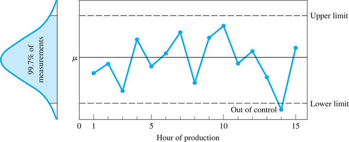
Fig. 22.19
EXAMPLE 2 Making x̄ and R control charts
A pharmaceutical company makes a capsule of a prescription drug that contains 500 mg of the drug, according to the label. In a newly modified process of making the capsule, five capsules are tested every 15 min to check the amount of the drug in each capsule. Testing over a 5-h period gave the following results for the 20 subgroups of samples.
| Subgroup | Amount of Drug (in mg) of Five Capsules | Mean | Range R | ||||
|---|---|---|---|---|---|---|---|
| 1 | 503 | 501 | 498 | 507 | 502 | 502.2 | 9 |
| 2 | 497 | 499 | 500 | 495 | 502 | 498.6 | 7 |
| 3 | 496 | 500 | 507 | 503 | 502 | 501.6 | 11 |
| 4 | 512 | 503 | 488 | 500 | 497 | 500.0 | 24 |
| 5 | 504 | 505 | 500 | 508 | 502 | 503.8 | 8 |
| 6 | 495 | 495 | 501 | 497 | 497 | 497.0 | 6 |
| 7 | 503 | 500 | 507 | 499 | 498 | 501.4 | 9 |
| 8 | 494 | 498 | 497 | 501 | 496 | 497.2 | 7 |
| 9 | 502 | 504 | 505 | 500 | 502 | 502.6 | 5 |
| 10 | 500 | 502 | 500 | 496 | 497 | 499.0 | 6 |
| 11 | 502 | 498 | 510 | 503 | 497 | 502.0 | 13 |
| 12 | 497 | 498 | 496 | 502 | 500 | 498.6 | 6 |
| 13 | 504 | 500 | 495 | 498 | 501 | 499.6 | 9 |
| 14 | 500 | 499 | 498 | 501 | 494 | 498.4 | 7 |
| 15 | 498 | 496 | 502 | 501 | 505 | 500.4 | 9 |
| 16 | 500 | 503 | 504 | 499 | 505 | 502.2 | 6 |
| 17 | 487 | 496 | 499 | 498 | 494 | 494.8 | 12 |
| 18 | 498 | 497 | 497 | 502 | 497 | 498.2 | 5 |
| 19 | 503 | 501 | 500 | 498 | 504 | 501.2 | 6 |
| 20 | 496 | 494 | 503 | 502 | 501 | 499.2 | 9 |
| Sums | 9998.0 | 174 | |||||
| Means | 499.9 | 8.7 | |||||
As we noted from the table, the range R of each sample is the difference between the highest value and the lowest value of the sample.
From this table of values, we can make an control chart and an R control chart. The chart maintains a check on the average quality level, whereas the R chart maintains a check on the dispersion of the production process. These two control charts are often plotted together and referred to as the –R chart.
In order to define the central line of the chart, which ideally is equivalent to the value of the population mean we use the mean of the sample means . For the central line of the R chart, we use . From the table, we see that
The upper control limit (UCL) and the lower control limit (LCL) for each chart are defined in terms of the mean range and an appropriate constant taken from a table of control chart factors. These factors, which are related to the sample size n, are determined by statistical considerations found in a more complete coverage of quality control. At the left is a brief table of control chart factors (Table 22.2).
Table 22.2 Control Chart Factors
| n | A | ||||||
|---|---|---|---|---|---|---|---|
| 5 | 2.326 | 1.342 | 0.577 | 0.000 | 4.918 | 0.000 | 2.115 |
| 6 | 2.534 | 1.225 | 0.483 | 0.000 | 5.078 | 0.000 | 2.004 |
| 7 | 2.704 | 1.134 | 0.419 | 0.205 | 5.203 | 0.076 | 1.924 |
The UCL and LCL for the chart are found as follows:
The UCL and LCL for the R chart are found as follows:
Figure 22.20 shows an chart of these data constructed using the statistical software Minitab. The top graph is the chart and the bottom graph is the R chart. Note that the central lines and control limits agree with the ones we calculated.
Fig. 22.20
This would be considered a well-centered process since which is very near the target value of 500.0 mg. We do note, however, that subgroup 17 was slightly outside the lower control limit and this might have been due to some special cause, such as the use of a substandard mixture of ingredients. We also note that the process was out of control due to some special cause of subgroup 4 since the range was above the upper control limit.
We should keep in mind that there are numerous considerations, including various human factors, that need to be taken into account when making and interpreting control charts. The coverage here is only a very brief introduction to this very important industrial use of statistics.
In Example 2, the weight (in mg) of a prescription drug was tested. Weight is a quantitative variable since its values are numeric.
Sometimes we wish to make a control chart for an attribute, which is a quality, or characteristic, that a sample member either has or doesn’t have. Examples of attributes are color (acceptable or not), entries on a customer account (correct or incorrect), and defects (defective or not defective) in a product. To monitor an attribute in a production process, we get the proportion of defective parts by dividing the number of defective parts in a sample by the total number of parts in the sample, and then make a p control chart. This is illustrated in the following example.
EXAMPLE 3 Making a p control chart
The manufacturer of video discs has 1000 DVDs checked each day for defects (surface scratches, for example). The data for this procedure for 25 days are shown in the table at the left.
For the p control chart, the central line is the value of which in this case is
The control limits are each three standard deviations from . If n is the size of the subgroup, the standard deviation of a proportion is given by
Therefore, the control limits are
Figure 22.21 shows a p chart constructed using Minitab.
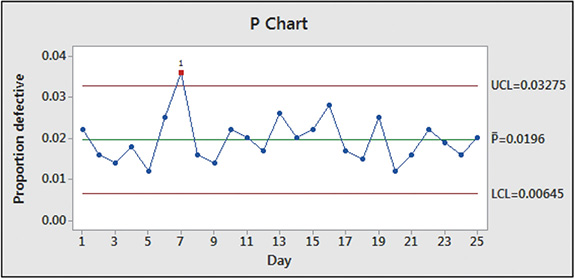
Fig. 22.21
| Day | Defective DVDs | Proportion Defective |
|---|---|---|
| 1 | 22 | 0.022 |
| 2 | 16 | 0.016 |
| 3 | 14 | 0.014 |
| 4 | 18 | 0.018 |
| 5 | 12 | 0.012 |
| 6 | 25 | 0.025 |
| 7 | 36 | 0.036 |
| 8 | 16 | 0.016 |
| 9 | 14 | 0.014 |
| 10 | 22 | 0.022 |
| 11 | 20 | 0.020 |
| 12 | 17 | 0.017 |
| 13 | 26 | 0.026 |
| 14 | 20 | 0.020 |
| 15 | 22 | 0.022 |
| 16 | 28 | 0.028 |
| 17 | 17 | 0.017 |
| 18 | 15 | 0.015 |
| 19 | 25 | 0.025 |
| 20 | 12 | 0.012 |
| 21 | 16 | 0.016 |
| 22 | 22 | 0.022 |
| 23 | 19 | 0.019 |
| 24 | 16 | 0.016 |
| 25 | 20 | 0.020 |
| Sum | 490 |
According to the proportion mean of 0.0196, the process produces about 2% defective DVDs. We note that the process was out of control on day 7. An adjustment to the production process was probably made to remove the special cause of the additional defective DVDs.
EXERCISES 22.5
In Exercises 1–4, in Example 2, change the first subgroup to 497, 499, 502, 493, and 498 and then proceed as directed.
Find UCL and LCL .
Find LCL (R) and UCL (R).
 How would the control chart differ from the top graph in Fig. 22.20?
- How would the R control chart differ from the bottom graph in Fig. 22.20?
In Exercises 5–8, use the following data.
Five automobile engines are taken from the production line each hour and tested for their torque (in ) when rotating at a constant frequency. The measurements of the sample torques for 20 h of testing are as follows:
| Hour | Torques (in ) of Five Engines | ||||
|---|---|---|---|---|---|
| 1 | 366 | 352 | 354 | 360 | 362 |
| 2 | 370 | 374 | 362 | 366 | 356 |
| 3 | 358 | 357 | 365 | 372 | 361 |
| 4 | 360 | 368 | 367 | 359 | 363 |
| 5 | 352 | 356 | 354 | 348 | 350 |
| 6 | 366 | 361 | 372 | 370 | 363 |
| 7 | 365 | 366 | 361 | 370 | 362 |
| 8 | 354 | 363 | 360 | 361 | 364 |
| 9 | 361 | 358 | 356 | 364 | 364 |
| 10 | 368 | 366 | 368 | 358 | 360 |
| 11 | 355 | 360 | 359 | 362 | 353 |
| 12 | 365 | 364 | 357 | 367 | 370 |
| 13 | 360 | 364 | 372 | 358 | 365 |
| 14 | 348 | 360 | 352 | 360 | 354 |
| 15 | 358 | 364 | 362 | 372 | 361 |
| 16 | 360 | 361 | 371 | 366 | 346 |
| 17 | 354 | 359 | 358 | 366 | 366 |
| 18 | 362 | 366 | 367 | 361 | 357 |
| 19 | 363 | 373 | 364 | 360 | 358 |
| 20 | 372 | 362 | 360 | 365 | 367 |
Find the central line, UCL, and LCL for the mean.
Find the central line, UCL, and LCL for the range.
Plot the chart.
Plot the R chart.
In Exercise 9–12, use the following data.
Five AC adaptors that are used to charge batteries of a cellular phone are taken from the production line each 15 min and tested for their direct-current output voltage. The output voltages for 24 sample subgroups are as follows:
| Subgroup | Output Voltages of Five Adaptors | ||||
|---|---|---|---|---|---|
| 1 | 9.03 | 9.08 | 8.85 | 8.92 | 8.90 |
| 2 | 9.05 | 8.98 | 9.20 | 9.04 | 9.12 |
| 3 | 8.93 | 8.96 | 9.14 | 9.06 | 9.00 |
| 4 | 9.16 | 9.08 | 9.04 | 9.07 | 8.97 |
| 5 | 9.03 | 9.08 | 8.93 | 8.88 | 8.95 |
| 6 | 8.92 | 9.07 | 8.86 | 8.96 | 9.04 |
| 7 | 9.00 | 9.05 | 8.90 | 8.94 | 8.93 |
| 8 | 8.87 | 8.99 | 8.96 | 9.02 | 9.03 |
| 9 | 8.89 | 8.92 | 9.05 | 9.10 | 8.93 |
| 10 | 9.01 | 9.00 | 9.09 | 8.96 | 8.98 |
| 11 | 8.90 | 8.97 | 8.92 | 8.98 | 9.03 |
| 12 | 9.04 | 9.06 | 8.94 | 8.93 | 8.92 |
| 13 | 8.94 | 8.99 | 8.93 | 9.05 | 9.10 |
| 14 | 9.07 | 9.01 | 9.05 | 8.96 | 9.02 |
| 15 | 9.01 | 8.82 | 8.95 | 8.99 | 9.04 |
| 16 | 8.93 | 8.91 | 9.04 | 9.05 | 8.90 |
| 17 | 9.08 | 9.03 | 8.91 | 8.92 | 8.96 |
| 18 | 8.94 | 8.90 | 9.05 | 8.93 | 9.01 |
| 19 | 8.88 | 8.82 | 8.89 | 8.94 | 8.88 |
| 20 | 9.04 | 9.00 | 8.98 | 8.93 | 9.05 |
| 21 | 9.00 | 9.03 | 8.94 | 8.92 | 9.05 |
| 22 | 8.95 | 8.95 | 8.91 | 8.90 | 9.03 |
| 23 | 9.12 | 9.04 | 9.01 | 8.94 | 9.02 |
| 24 | 8.94 | 8.99 | 8.93 | 9.05 | 9.07 |
Find the central line, UCL, and LCL for the mean.
Find the central line, UCL, and LCL for the range.
Plot the chart.
Plot the R chart.
In Exercises 13–16, use the following information.
For a production process for which there is a great deal of data since its last modification, the population mean and population standard deviation are assumed known. For such a process, we have the following values (using additional statistical analysis):
The values of A, and are found in the table of control chart factors in Example 2 (Table 22.2).
In the production of robot links and tests for their lenghs, it has been found that . and . Find the central line, UCL, and LCL for the mean if the sample subgroup size is 5.
For the robot link samples of Exercise 13, find the central line, UCL, and LCL for the range.
After bottling, the volume of soft drink in six sample bottles is checked each 10 min. For this process and . Find the central line, UCL, and LCL for the range.
For the bottling process of Exercise 15, find the central line, UCL, and LCL for the mean.
In Exercises 17 and 18, use the following data.
A telephone company rechecks the entries for 1000 of its new customers each week for name, address, and phone number. The data collected regarding the number of new accounts with errors, along with the proportion of these accounts with errors, is given in the following table for a 20-wk period:
| Week | Accounts with Errors | Proportion with Errors |
|---|---|---|
| 1 | 52 | 0.052 |
| 2 | 36 | 0.036 |
| 3 | 27 | 0.027 |
| 4 | 58 | 0.058 |
| 5 | 44 | 0.044 |
| 6 | 21 | 0.021 |
| 7 | 48 | 0.048 |
| 8 | 63 | 0.063 |
| 9 | 32 | 0.032 |
| 10 | 38 | 0.038 |
| 11 | 27 | 0.027 |
| 12 | 43 | 0.043 |
| 13 | 22 | 0.022 |
| 14 | 35 | 0.035 |
| 15 | 41 | 0.041 |
| 16 | 20 | 0.020 |
| 17 | 28 | 0.028 |
| 18 | 37 | 0.037 |
| 19 | 24 | 0.024 |
| 20 | 42 | 0.042 |
| Total | 738 |
For the p chart, find the values for the central line, UCL, and LCL.
Plot the p chart.
In Exercises 19 and 20, use the following data.
The maker of electric fuses checks 500 fuses each day for defects. The number of defective fuses, along with the proportion of defective fuses for 24 days, is shown in the following table.
| Day | Number Defective | Proportion Defective |
|---|---|---|
| 1 | 26 | 0.052 |
| 2 | 32 | 0.064 |
| 3 | 37 | 0.074 |
| 4 | 16 | 0.032 |
| 5 | 28 | 0.056 |
| 6 | 31 | 0.062 |
| 7 | 42 | 0.084 |
| 8 | 22 | 0.044 |
| 9 | 31 | 0.062 |
| 10 | 28 | 0.056 |
| 11 | 24 | 0.048 |
| 12 | 35 | 0.070 |
| 13 | 30 | 0.060 |
| 14 | 34 | 0.068 |
| 15 | 39 | 0.078 |
| 16 | 26 | 0.052 |
| 17 | 23 | 0.046 |
| 18 | 33 | 0.066 |
| 19 | 25 | 0.050 |
| 20 | 25 | 0.050 |
| 21 | 32 | 0.064 |
| 22 | 23 | 0.046 |
| 23 | 34 | 0.068 |
| 24 | 20 | 0.040 |
| Total | 696 |
For the p chart, find the values for the central line, UCL, and LCL.
Plot the p chart.
Answers to Practice Exercises
Mean: no change; range: 8.8